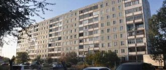
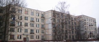
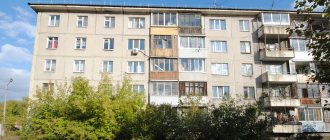
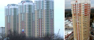
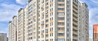
series 111-90 photo
111-90 is a series of panel multi-section houses, the development of which began in 1960; more than 180 different standard projects were developed, including: end, row, rotary and corner. They are found in many cities, with the exception of capitals: in Novosibirsk, Kazan, Veliky Novgorod, Rostov-on-Don, houses 111-90 are also in Minsk. If you are interested in premises in Moscow for the activities of your work team, company, legal organization and other forms of work, then we recommend paying attention to the profitable office rental near the Volzhskaya metro station.
The first houses 111-90 began to be built in 1971. During construction, various finishing options for facades and external panels were used.
Characteristics of the series of houses 111-90:
Type of house - panel Number of floors - 2-10 Height of living quarters - 264 cm Apartments - 1,2,3,4 rooms Manufacturer - local reinforced concrete structures Years of construction - 1971-2000s Cities of distribution - USSR (all-Union series)
Slightly modernized house series 111-90
Internal transverse walls are in increments of 300 and 360 cm, with spans of 570 and 660 cm; series of houses for some cities were in increments of 320, 510 and 600 cm. External walls made of reinforced concrete panels have a thickness of 300 to 400 mm, internal walls - 120 or 160 mm, partitions and ceilings made of reinforced concrete, thickness 60 and 120 or 160 mm, respectively. The standard ceiling height is 2.64 meters. There are several modifications of the 111-90 series, which are actively being built in provincial cities nowadays, and do not have any fundamental differences from the basic series.
There is one passenger elevator at the entrance, a garbage chute valve on the interfloor staircases.
111-90 is a series of panel multi-section houses, the development of which began in 1960; more than 180 different standard projects were developed, including: end, row, rotary and corner. They are found in many cities, with the exception of capitals: in Novosibirsk, Kazan, Veliky Novgorod, Rostov-on-Don, houses 111-90 are also in Minsk.
The first houses 111-90 began to be built in 1971. During construction, various finishing options for facades and external panels were used.
Characteristics of the series of houses 111-90:
- House type – panel
- Number of storeys – 2-10
- Height of living quarters – 264 cm
- Apartments – 1,2,3,4 rooms
- Manufacturer - local reinforced concrete products
- Years of construction: 1971-2000.
- Cities of distribution - USSR (all-Union series)
A slightly modernized house of the 111-90 series. Internal transverse walls go in increments of 300 and 360 cm, with spans of 570 and 660 cm, series of houses for some cities went in increments of 320, 510 and 600 cm. External walls made of reinforced concrete panels have a thickness of 300 to 400 mm, internal - 120 or 160 mm, partitions and ceilings made of reinforced concrete, thickness 60 and 120 or 160 mm, respectively. The standard ceiling height is 2.64 meters. There are several modifications of the 111-90 series, which are actively being built in provincial cities nowadays, and do not have any fundamental differences from the basic series.
There is one passenger elevator at the entrance, a garbage chute valve on the interfloor staircases.
Structural diagram of load-bearing walls
The diagram shows load-bearing panels in green. The remaining walls are not load-bearing.
Floor slabs and coverings are prefabricated reinforced concrete 160mm thick, supported along the contour and 3 sides. Heavy concrete slabs of 1-10 floors class C25/30, above – C12/15. The slabs have holes and openings for the passage of utilities. There are embedded parts for connection with each other, as well as with external walls and loggia slabs.
Loggias made of 160mm slabs, supported according to a beam pattern and having perforations to eliminate cold bridges.
The walls of the elevator shaft are prefabricated reinforced concrete thicknesses. 120mm.
Ventilation blocks for sanitary facilities are reinforced concrete unified type VB1-28.
Residential building series M111-90: all the features of the project and layout
Residential buildings of the M111 series were built back in 1976. In 1997, they were significantly modernized, receiving an additional number 90 to the series. Thanks to the modernization, apartments in such houses became much more comfortable. Firstly, the area of both the apartments themselves and kitchens and bathrooms has increased significantly; secondly, so-called remote loggias have appeared, and the layout itself has become more rational.
The number of floors in the houses of this series is 9, 16 and 19. There are either 4 or 7 apartments per floor. There are two elevators, one passenger, the other freight. Bathrooms in all apartments of the houses are separate. The area of kitchens ranges from 9.5 to 13.1 square meters. The ceilings are quite high, about 2.6 m. Some apartments have storage rooms and built-in wardrobes.
In such houses, it is possible to dismantle some partitions without harm to the structure and wiring, of course, only after consultation and obtaining the appropriate permission. However, even without significant changes, interesting design projects can be developed for apartments in houses M111-90.
Custom-made kitchens for home M111-90 series
Most often they are made with linear or angular layouts, sometimes they use a U-shaped layout if there is no need for a large dining area. A linear configuration (straight) involves installing all cabinets along one wall, a corner (L-shaped) configuration along two adjacent walls, and a U-shaped configuration along three or two. The square design of the kitchens also allows you to install a bar counter. Let us consider below the various options for the above-listed layouts for the kitchens of houses in the M111-90 series.
Corner kitchen with facades made of light plastic for an area of 9.5-10.1 square meters
The first example invites us to use a corner layout. As you can see from the photo, the set is located along two walls, leaving the window open. The table top is rounded around the corner to ensure safety of movement around it. Light plastic was chosen for the facades - the best option for a relatively small space. The dining table was chosen to match the façades and was installed with its end facing the wall, making it possible to seat 4-5 people at it. Transparent chairs do not clutter up the space, which is again perfect for 9-10 squares.
U-shaped kitchen with fronts without handles for an area of 9.5-10.1 square meters
The second photo shows an example of how you can use a U-shaped layout in a kitchen of 9-10 square meters. To make it successful, so that the kitchen is spacious enough, use the area near the window, along which you can install a countertop. You can cook something on the countertop, and also use it as a dining table. The facades of this kitchen are made of white plastic; they are without handles; instead of them, recesses made by milling are used. The tabletop is made of laminated chipboard with a wood pattern. This combination is typical of the Scandinavian style and is perfect for small kitchens.
Order a kitchen for your home series M111-90
you can also use the linear layout mentioned above. In this case, there will be more free space that can be used for a dining group.
For a larger area (13 square meters), more complex options for kitchen sets can be considered.
Corner kitchen with pencil case for 13 squares
The photo shows a kitchen with a corner layout, the facades of which are made of acrylic in beige and lilac colors. The peculiarity of the kitchen is that on the opposite side of the main unit there is a pencil case with a hidden refrigerator and a seat with lower cupboards. A round table takes up less space, but at the same time makes it possible to seat 4-5 people at it. This layout allows you to acquire a sufficient number of cabinets for storing dishes and other household items, and leave space for a TV, as well as a dining area.
You can use not only plastic and acrylic for facades, but also other materials: Egger and Kronospan chipboard, Alvic, Cleaf chipboard, FENIX NTM plastic, painted and framed MDF, veneer, solid wood. Kitchens made from the listed materials are presented in the catalog of our website. Get acquainted with the examples, decide on the style and call the designer for a measurement. We will create for you an interesting and unique kitchen project for the home of the M111-90 series
.
Decorating a room in a panel house
In an apartment with one room, it is very difficult to change the interior. If the living room area allows it, then a suitable option would be to install a plaster partition, thereby separating, for example, a children’s room from the living room.
You can hang beautiful paintings or frames with family photos on the partition. In this case, roller blinds and Roman models will look impressive on the windows, thereby not cluttering up the missing space. An armchair - a bed or a small sofa that can be folded up at any time - is suitable for a child's room.
Design of standard apartments (25 photos)
Each era is characterized by its own features, which are primarily manifested in the construction of multi-storey residential buildings. External uniformity, identical layouts, the use of the same building material - this is what distinguishes one series of houses from another. Despite the fact that most apartments currently come from the USSR, it is possible to create the design of a typical apartment in such a way that it meets the most modern requirements.
The currently available standard residential buildings can be divided into several conventional categories based on the era of construction. Each of them has its own advantages and disadvantages, which can be advantageously emphasized or, on the contrary, veiled, you just need to competently design the interior of a typical apartment.
The first standard houses began to be built in the late 30s – early 50s of the last century and were called “Stalin houses”. Apartments of this type are distinguished by high ceilings (up to 3.5 meters) and large areas. Often there were one-room and two-room apartments with an area of up to 50 m² and 70 m², respectively, and the area of three-room apartments even reached 85 m². The advantages of these houses also include good noise and heat insulation, due to the fact that they were built from brick.
No professional would refuse to decorate the interior of a typical apartment belonging to this category. After all, no matter how bold the design ideas for a typical apartment may be, bringing them to life will not be difficult.
The end of the 50s was marked by the construction of new four- and five-story panel and block houses, which were nicknamed “Khrushchevkas”. At this time, the country was in dire need of mass and inexpensive housing construction. That is why the new apartments were characterized by low ceilings, a small kitchen (up to 6 m²) and combined bathrooms. As a rule, the area of one-room “Khrushchev” apartments did not exceed 30 m², two-room apartments were no more than 43 m², and the total area of three-room apartments was on average 60 m².
When creating an organic and functional design for a typical apartment of this series, you have to try. In order to somehow increase the space, more and more often in “Khrushchev” they resort to combining the living room and kitchen and use some design tricks - they give preference to light colors, purchase low furniture, play with light - all this allows you to visually increase the area of the room.
Since the mid-60s of the last century, nine-story buildings began to be built, and a little later the first twelve-story buildings appeared. The advantages of these apartments are the thoughtful arrangement of rooms and large areas. That is why they were called apartments with an improved layout. Popularly, by analogy with the previous series, they were called “Brezhnevki”, which is not entirely fair, since some of the most successful projects are used in the construction of houses even at the present time. Professional design of standard apartments with an improved layout, developed taking into account the owner’s requirements, will allow you to turn a standard room into an original one, with its own soul.
Since the beginning of the 90s of the 20th century, the term “design of standard apartments” has become less relevant, because more and more people began to move away from standard layouts, and this trend has continued to the present day. Each new multi-storey building is different from the others. The apartments in these houses are famous for their large areas, individual layouts are created based on the requirements of buyers, and the most modern finishing materials are used.
It is the design of standard apartments (if we still use this definition) of this type that professionals most often encounter. Any design fantasies can be brought to life in such apartments; they will be limited only by the wishes of the owner and his capabilities.
Every owner of a standard apartment dreams of turning it into a special, unique one. Forget that it comes from the USSR and make it modern and stylish. No matter how impossible this task may seem, with a little effort and imagination, you can create the interior of a typical apartment, which in no way will be inferior to the design of modern “elite” apartments.
Design of two and three room apartments in panel houses
Housing with more than two rooms is not difficult to redevelop. If there are two people at seven, then one of the rooms is allocated as a bedroom. The classic version in the Rococo, Empire style is suitable for it. Another room is perfect for an office, guest room, or dining room. It looks very harmonious in the style of pop art, kitsch. If there is a child in the family, then one of the rooms will be a nursery.
It is advisable to arrange it in agreement with the child, depending on age. For a small child, you need to make the room bright, add a couple of paintings with animals, a lamp, and soft toys.
For a teenage girl, a furniture-chic design is suitable. This romantic style will add charm to the room. For a boy of the same age, it would be best to have a room with a play area in the avant-garde, loft or high-tech style.
You can also add sophistication to your apartment with the help of decor. Place flowers in a vase or hang climbing ornamental plants on the wall, a panel, a picture with handmade embroidery, etc.
Throw soft pillows or toys on the sofa. Place a rug that is comfortable for your feet next to the sofa. As you noticed, it’s not all that difficult when creating your own design and interior in a panel house. The main thing is imagination!
Ideas for decor and design in a panel house
- Style. For panel apartments, the most suitable design would be in a country style or in an ethnic style.
- Remove all unnecessary junk and interior items that you will change.
- Hallway. Spacious furniture: a wardrobe, a table for the toilet, a shoe stand will fit just right.
- Corridor. Along the wall you can place small cabinets for storing umbrellas, hats, and boxes of shoes.
- Toilet and bathroom, if they are combined, then a corner bath, sink, linen closet, shelf for toiletries and washing machine will look great.
The website faneramonolit.ru always has laminated plywood in stock, a huge selection and low prices for the entire range of plywood in Moscow.
The bathroom unit will look harmonious in non-dark colors.
To make the bathtub look more spacious, the tiles should be beige or light brown. Mirrors and suspended ceilings will also increase the visual space.
A glazed loggia or balcony can also be used wisely. You can put a small table and chairs on the loggia. Throw in a rug, cover the windows with blinds or curtains, add flowers and turn it into a cozy place where you can sit with friends or have dinner with your family in the evening. The balcony can also serve as a greenhouse or study.
Design of a one-room apartment in a panel house
It is very difficult to arrange a one-room apartment, since one room serves as a bedroom, a workplace and a living room. Therefore, you need to use every corner of your home for your interior.
How to increase the kitchen area in a panel house?
The primary task that needs to be solved in the process of making changes to the layout of the kitchen area in a residential building is to increase the space as much as possible. Despite the complexity of the task, it is quite possible to solve it and achieve tangible results even without demolishing the partitions and combining the kitchen with the living room. To do this, you need to perform several relatively simple steps.
- First you need to dismantle the door and replace it with an arch. This will make the kitchen design space in a panel house a little more spacious.
- It is necessary to replace outdated cast iron batteries with modern, stylish and technologically advanced radiators of the new generation. You will be surprised when you see how much space the radiators of the previous model took up. Kitchen design 9 meters in a panel house photo ideas:
- Having a pantry close to the kitchen is a wonderful opportunity. You can punch a hole in the wall of the pantry, which is in contact with the kitchen, and install a sink there.
- In a situation where there is a door to the loggia in the kitchen area, it is possible to dismantle it and place a tabletop or counter instead of a window sill, like in a bar. As a result, you can increase the area by approximately 2 square meters. m. See the design of a kitchen with a balcony in a panel house:
- Kitchen design in a panel house with a window. The window can also be expanded due to the light opening. To make this possible, you need to choose metal-plastic windows with a narrow sash.
If you have certain knowledge and experience, then all these changes in the layout can be carried out yourself, and besides, it will not take much time.
Arrangement of the hallway of a three-room apartment
When creating the interior of a three-room apartment, you need to start with the room that makes the first impression upon entering the house - that is, the hallway. The large space allows you to accommodate a closet - a wall, a dressing table with drawers and a shoe shelf.
Shelving will help set the appearance of the corridor; you can place accessories, paintings, photo frames and books on them. Of course, such a room is poorly lit, sometimes even dark, so the best lighting devices are used for high-quality lighting.
The hallway is a room that is always visible and its overall design should be combined with the interior design of a three-room apartment. The harmony of the corridor emphasizes the good taste of the owner of the house.
Kitchen design in a panel house apartment
In most standard panel residential buildings, the space for the kitchen area is allocated almost according to the principle of residual space. For this reason, kitchen interiors are almost identical. In fact, this is not an easy task at all - to come up with a unique and interesting kitchen design in an ordinary block apartment building, provided that the kitchen space occupies only 5 to 9 square meters. m. Kitchen design 9 sq m panel house 45 photos of interior ideas.
There are several simple recommendations on how you can decorate the kitchen space in a standard residential apartment in a beautiful, functional and cozy way. As a result, you will be able to create a unique and unique kitchen design in a panel house. Kitchen design in a panel house apartment photo:
A few secrets of kitchen interior design
To implement an interesting kitchen design in a panel house, you will need knowledge of certain nuances and tricks. There is always an opportunity to visually increase the kitchen space. The use of certain finishing techniques can also add spaciousness to the kitchen area.
- It is better to make the walls in the kitchen of a panel residential building light, but you should not use white. Walls covered with white will quickly get dirty and will also not look very expressive. It is worth choosing light shades.
- Kitchen design for a 9 sq m panel house - vertical lines can visually make the kitchen a little higher. In addition, a combination of a dark color on the floor with a light tone on the ceiling can visually increase the height of the kitchen space.
- You can resort to using elements made of glass or mirror. For example, transparent kitchen facades or a glass-coated countertop can visually reduce the cramped space in the kitchen. Kitchen design 9 meters in a panel house:
- A reasonable solution would be to use more than one lighting source. As a complement to a standard chandelier, you can use a backlit headset or a pair of lamps. This will not only be aesthetically pleasing, but will also provide comfort while preparing food.
