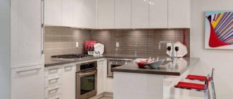
The interiors of country house kitchens differ in layout, design style, surface finishing materials and color schemes. After reading this article, you will get an idea of the basic requirements for kitchen design, what interesting ideas people have implemented in their kitchens and how to combine all this with the decor of the rest of the rooms.
The main thing in the kitchen interior is harmonious functionality Source architizer.com
Kitchen layout in a private house
Kitchen design should take into account the individual characteristics of the room:
- size and shape of the room;
The most popular kitchen shape is a rectangle, and light furniture visually increases the space Source pinterest.com
- combined /separate with other rooms;
- the presence of stove heating (tile stove) or boiler in the kitchen;
An example of a successful kitchen interior with a built-in oven Source lubeoiladd.com
- number of windows and doors in the room (pass-through kitchen, with access to the terrace, etc.)
Taking into account the number of windows for planning the placement of kitchen appliances and furniture Source gazeta-pravo.ru
The layout of the room depends on what answers are given to these questions.
In the kitchen, every element and detail has a practical use, for example, a window above the sink Source www.homify.ru
When planning the interior, follow the rule of the working triangle: the distance between the sink and the refrigerator is from 0.45 to 2 m; from a gas or electric stove to a sink - from 0.6 to 1.8 m. On the way from the refrigerator to the sink there is a primary food processing area, drawers or shelves with cereals and pasta. From the sink to the stove: heavy kitchen utensils, dishwasher, microwave and more.
More space – more possibilities Source sv.dikidaycare.com
Kitchen-dining room and kitchen-living room
If the room is combined with the rest of the house: the living room or dining room, the kitchen design requires special attention to detail and the compatibility of furnishings with each other. The open plan offers a perfectly thought-out interior.
Impeccability is one of the main requirements for a kitchen-living room Source svoimy-rukami.ru
Design Tips:
- a powerful hood in the room to prevent cooking odors from wafting throughout the house.
A kitchen hood is a must Source houzz.com
- It is better to decorate the interior of the kitchen in the house in minimalism , eco-style , neo-classic , Scandinavian style, since a mess in the kitchen can greatly irritate household members in the living room.
Laconic kitchen interior - the optimal design solution Source altdesign.3dn.ru
- Otherwise, you can divide the space of the kitchen-dining room by installing small movable partitions and screens .
- In a country house where a kitchen-living room arched openings or columns in a classic style, or floor-to-ceiling glass partition will look interesting
Zoning with arched openings Source baneproject.com
Another example of division into zones with an arch Source opora-stroy.ru
- To make the room look organic, zone the space: in the kitchen, use tiles for the floor, porcelain stoneware , and in the living room - laminate , parquet .
Bright, light kitchen in a classic style Source assz.ru
- A multi-level ceiling and walls with different finishes (tiles in the kitchen, wallpaper in the living room) will also allow you to delimit the space and bring dynamics to the room. Paths and carpets will also help zone the room.
Different levels Source imageskite.ru.net
- Diversified lighting of zones (in the kitchen - brighter lighting, in the living room - more subdued and soft). Lamps in the work area can be more modest and laconic, in the relaxation and dining areas - luxurious , distinguished by an abundance of details.
An example of a kitchen-living room in the same style without highlighting and obvious zoning Source arenda.mirkvartir.ru
- General lighting in the kitchen is complemented by LED lighting above the surfaces. The living room is given a special charm with the help of wall sconces and floor lamps .
- At the borders of the kitchen and dining /living areas there are pieces of furniture: a bar counter, a sofa , a table with chairs, an island for cooking and eating breakfast, shelves with books and much more.
Walk-through kitchen
If a room has several entrances/exits, it is advisable to reduce their number to a minimum, for example, by combining a veranda and a kitchen.
Kitchen with entrances/exits Source houzz.com
The design of a small walk-through kitchen in a private house requires compliance with the following rules:
- Place the work triangle (sink, stove, refrigerator) away from the main route of family members (hallway-living room), so those passing by will not interfere with the cooking process.
Small walk-through kitchen Source houzz.ru
Implementation of a kitchen with numerous adjoining rooms Source remontonly.ru
- The dining table can be placed by the window to enjoy your meal in peace.
When there is plenty of everything – both light and space Source benimmulku.com
- Place a refrigerator near the veranda or pantry It will be convenient to immediately put the desired product in the refrigerator from the pantry and take it out if necessary. In the same way, when going out to the summer premises, to the terrace, you can take provisions with you for organizing a feast in nature.
Working areas in a walk-through kitchen are often arranged parallel to each other or in an “L” shape; a “U” shaped layout is less common.
Working and living area Source burosneg.ru
It is better to place the refrigerator in an “L”-shaped arrangement in line with the sink. Ideally, the latter can be placed in the corner of the kitchen.
An example of a solution for a work area in a very narrow kitchen Source medicroslavl.ru
The parallel arrangement of items is used in a narrow walk-through kitchen. On one line there is a sink and a stove, and on the second - a refrigerator and a peninsula. In this case, the width of the passage between the working surfaces should be at least 1.2-2.4 m.
For a narrow kitchen, parallel arrangement of items is recommended Source www.remontbp.com
Kitchen over 20 sq.m.
A large, regular-shaped kitchen (rectangular or square) with a separate entrance is the dream of most country house owners. In such a room, with proper organization of space, it is pleasant to receive guests and prepare food.
The main thing in a large area is not to make the space bulky due to the abundance of objects Source m.yandex.ru
Many designers recommend installing a kitchen set here with a separate island table for cooking and eating. Then you can immediately send the finished dishes to your household for tasting or simply communicate with them while dinner is being prepared. A multifunctional island usually also includes a sink and a small refrigerator with a stove and oven, food storage cabinets (groceries), a wine department, etc.
Multifunctional island in a generous size Source houzz.es
To organize an island kitchen, it is important that the passages around such a miracle table are at least 1-1.2 m.
Plenty of space and access Source pacificcrown.ca
In a large square kitchen with many doors and windows, a cooking island is often the only way out of the current situation. In small niches along the wall you can place a refrigerator and microwave, oven and other cabinets for storing food. The dining area in a square kitchen is often located near the window.
Square kitchen Source yandex.by
A popular solution among designers is to place the sink near the window. Then the process of washing dishes can be combined with monitoring the garden/vegetable garden, children's playground, depending on where the kitchen windows face. You can also place a work area with a refrigerator and cabinets for storing cereals here.
Another example of practicality Source thekomod.ru
Kitchen less than 20 sq.m.
The interior of a small dining room in a private house with a cooking area includes kitchen cabinets, a stove and a refrigerator with a sink, located in one line along one wall. Then along the opposite wall you can place a dining area. This arrangement is quite justified if there is a lack of square meters.
When you need to fit into a limited space Source houzz.es
The size is small, but how well the square meters are used Source remontbp.com
Important ! Which style trends are most popular in a country house depends on the general style of the building’s facade and the materials from which the house is made.
Masking doorways
In order for the interior of a walk-through kitchen to be perceived as holistic and complete, sometimes there is a need to hide the doorways. Furniture copes best with this task. You can make a pattern on the walls that will continue on the door leaf. It is best if the entire interior is made in the same style, then it will be perceived as lively and interesting.
A sliding partition can be installed in any doorway, which will preserve the feeling of a common space. The openings can be closed or left open at any time.
Kitchen in a log house
In wooden houses made of logs, where the exterior breathes antiquity and comfort, the French rustic style - Provence or country, the Russian style of a country estate, rustic or Gustavian design trends will look most harmonious.
Rustic style for a log house in a dark design Source stroyfora.ru Light colors of rustic style Source trash-work.ru
See also: Catalog of companies that specialize in interior redevelopment services.
Kitchen "Provence"
The design direction is characterized by unobtrusive finishing and discreet color schemes. The shades of the walls and textiles seem to be bleached by the sun: olive, lavender and lemon with golden and beige.
Simplicity and “nationality” of the Provence direction Source dizayndoma.net
Time-worn, painted furniture, doors and kitchen facades can be either white or turquoise, olive, blue, sand.
The presence of beams is inherent in the direction Source landshaftadvice.ru
The pattern on the curtains is often small with flowers or plant motifs. The walls are painted in white, corn or milky tones.
Classic French “Provence” Source mobohan.ru
The most attractive detail of Provence is the natural-colored ceiling beams, a large antique sideboard, textiles with floral motifs (scallops, cockerels, daisies, lavender, dandelions, sunflowers): tablecloths, potholders, towels, curtains, everything here gives off a rustic feel.
Turquoise tenderness Source opora-stroy.ru
Country cuisine
The style is very similar to Provence. Here, a maximum of wood is also used in the decoration of facades, floors, and ceilings. There is a ban on the use of plexiglass and plastic in such a kitchen. The kitchen apron can be decorated with tiles with plant patterns.
The sweetest “Country” does not look bourgeois Source kbkuhni.ru
Lamps are used with fabric lampshades; the chandelier can be forged from bronze. Kitchen facades are decorated using decoupage technique. The floors are often covered with homespun rugs.
Country loves attention to detail. Kitchen shelves are most often open, with painted plates, copper and wooden utensils.
And it can even be strict Source mebel-go.ru The peculiarity of the style is many objects Source homez.design
Clay pots with spices and herbs in the kitchen will fit perfectly into the interior. Bundles of onions and garlic are often hung from the ceiling.
Bunches of garlic and onions - a style icon Source pinterest.com
Pros of inexpensive kitchens
In order to update your interior, you don’t always need to save money for a whole year. Cheap kitchen renovations can be done by ordering an inexpensive set and replacing the kitchen apron.
Inexpensive kitchen furniture has several advantages:
- An inexpensive set of bright colors can radically change the appearance of a room;
- Economical sets are usually made from modules that fit into standard apartments, even with very small kitchens;
- Thanks to modules of different sizes, both inexpensive straight sets and cheap corner kitchens can be easily formed;
- Thanks to their mobility, the modules can be rearranged and the interior changed several times without replacing furniture;
- Suites are usually equipped with spacious drawers and cabinets.
Kitchen in a house made of wood, glass and metal
If the building has metal and glass parts, for example, large panoramic windows or walls, modern industrial styles will fit well into the room: Scandinavian, hi-tech, loft.
Where there is a lot of glass and stone and no trinkets Source pinterest.com
Merging with nature Source pinterest.com
"Scandinavian" cuisine
Modest and minimalist Scandinavian design is suitable for lovers of white. This style is ideal for a kitchen that seems to merge with the natural landscape due to large windows. Since there are minimal details used here, the kitchen appears spacious and uncluttered.
Simplicity and grace in a modest and discreet Scandinavian style Source pinterest.com
The style welcomes light wood for furniture and flooring (alder, pine, linden, ash), glossy facades with a minimum of decor. Olive, orange, and yellow colors are used as color accents.
Abundance of light and light colors Source houzz.com Another fragment of “Scandinavian” cuisine Source divan.ru
Why so cheap
Cheap economy kitchens cost so little for several reasons:
Cheap kitchens in Moscow or any other city are produced by local manufacturers. Kitchens made from inexpensive materials are also produced in other countries, but due to delivery they will cost much more than local ones. Conclusion: look for a manufacturer in your city.
Modular kitchens are cheap to produce. The factories have established mass production of standard cabinets and cabinets. Then, like a construction set, a set is formed from them.
MDF, chipboard and plastic are used in production; they are much cheaper than wood and veneer.
Such headsets have a standard, laconic appearance; they do not have smooth lines or unnecessary decorative details, so such headsets look laconic and modern, and are cheaper.
Kitchen in a house made of stone and brick
The choice of style for the kitchen in such a house is wide; it can be an eternal, timeless classic: Empire, Chinoiserie, American or English style.
For stone and brick Source jmsi.ru
Classic
Classic style is the most preferred for kitchen interior design. When furnishing a kitchen, they apply the rules of symmetrical arrangement of furniture; built-in niches with lighting and columns with pilasters are used to disguise shortcomings.
Unbending and eternal Source corunaotorrino.com
Moderately strict Source mebel-go.ru
All materials must be natural. If the table and chairs are wooden, the facades of the kitchen units are often with paneled parts, the ceiling is multi-level plasterboard or suspended.
Classic loves elegant volumetric chandeliers Source yandex.ru
Kitchen appliances here should not stand out; their shades range from white to metallic.
The eye does not highlight anything, all objects are organically intertwined Source refdsg.co
Textile ornament: checkered, striped, floral pattern.
Neoclassical
Modern classics will harmoniously fit into the design of a combined kitchen-dining room or living room. A combination of antique accessories such as wrought iron chandeliers and candlesticks with the latest lamps is used here.
Classic design of a small kitchen with modern elements - neoclassic Source dekorin.me
Wall decoration elements: moldings and cornices, mirror panels, etc.
Photo apron
Printing images is possible both on mosaics (made from small ceramic squares) and on glass. A photo apron will definitely give your kitchen an unusual look. You can choose any drawing.
For small kitchens, abstract or geometric patterns are suitable. For a large kitchen, you can choose a large drawing, even a landscape, even an image of animals, or a still life.
Of the proposed options, an apron with photo printing will cost the most, but if you choose it as the center of the composition, then you can choose even the cheapest and most laconic furniture set.
Patterned aprons also have a drawback. If this is a print on glass, then over time it will fade and will not be as bright. The design is applied to the tile using a special film.
If one of the tiles cracks, this film may peel off, making it very difficult to replace. Be careful when operating and then these problems will be avoided.
As you can see, in order to completely update the appearance of your kitchen, you don’t have to invest a lot of money. Choose more budget-friendly options for decorating the apron and furniture, assemble the set and glue the apron yourself, this way you will at least halve the cost of repairs. Don't be intimidated by cheap materials. Modern technologies make it possible to make things that are inexpensive, but durable and beautiful.
Kitchen in an attic house
If, for some reason, the kitchen has to be located on the attic floor, or the house design is very unusual and the room consists of sloping walls and sharp corners, a linear kitchen layout will help, providing for the placement of kitchen cabinets and the work area as a whole along one wall.
The kitchen can also be located in the attic Source remontik.org It’s as if the attic was specially made for this kitchen Source gpmplus.com
As for the style for such a project, any of the modern styles can be chosen: modern, minimalism, eco-style, art deco.
Spacious kitchen in the attic Source yandex.ru
Eco-style kitchen
Finishing a kitchen in a private house involves only natural materials: rattan, bamboo, cork, wood, metal in a minimum amount, stone.
Eco-kitchen, where it is harmless Source ealworks.org
Colors: natural shades of wood, greenery, stone and flowers.
Art Deco kitchen
Art Deco is a very bold and complex style in the interior. Combinations of classics, ethnic style and modern interiors are used. Only a professional designer with an excellent sense of taste can realize it. A variety of color combinations are used here: from lilac to pearl, bright accents and unusual materials.
Art Deco in the kitchen Source www.homeandinteriors.ru Bold art deco loves lilac Source mainavi.ru Difficult to implement and luxurious art deco Source yandex.tj
And some more useful information
- According to SNIP rules, under no circumstances should a stove be placed under a window in the kitchen. Moreover, this solution is simply not practical, because it is too difficult to wash grease from glass and curtains every day.
- In most cases, the battery under the window is easily hidden in furniture. The main thing is to provide ventilation grilles in its design for the circulation of warm air. If the battery under the window still gets in the way, then you can move it to an adjacent wall, replace it with a smaller radiator, or completely abandon it in favor of a heated floor system.
- Remember that the window should be approximately 1.5-2 cm or higher above the level of the countertop or bar counter.
- No matter how you use the windows in the kitchen, try not to clutter the window sills with extraneous things, accessories and appliances (except, perhaps, a small coffee machine). The best options for decorating it are indoor flowers, decorative topiary, candlesticks, small stacks of books, and photo frames.
- The window can become the main decoration of the kitchen. To do this, it needs to be decorated with beautiful curtains and/or decorated with a beautiful frame, for example, a matching colored set.
Support the project - share the material with your friends on social networks:
How to combine kitchen design with home
The interior of a kitchen in a private house is planned based on the style of the remaining rooms. If the living room and bedrooms are neoclassical, design the kitchen in the same direction. High-tech can be combined with techno style and any industrial style (constructivism, loft). Scandinavian is essentially an offshoot of eco-style. Provence and country are related design trends. The finishing materials used are the same as in the other rooms, so the unity of the design is maintained.
An example of an organic combination of a kitchen with adjacent rooms Source villapola.com An example of a kitchen that can be easily combined with many styles Source yandex.ru
Furniture
Since the kitchen contains a lot of furniture and household appliances, you need to arrange them in such a way as to make maximum use of the available space. Taking into account the location of windows and doorways, there are several options for what the design of a walk-through kitchen :
- adjacent doorways. The best solution is when all the movement is carried out in one corner, when the rest of the room can be used at its discretion. For example, a kitchen set is placed near one wall with an opening, and a dining table will stand near the other;
- through passage. In this case, it is better to select several zones. In one there will be a dining table, and in the other there will be a workplace;
- two openings on one wall. The arrangement of furniture is similar to the previous case. You can place a small table near the wall, and use the main part of the room for appliances and kitchen furniture. This option has one drawback - people will periodically walk around the table.
Style advice
If you have just built a house and have not yet decided what style to decorate it in and how to organize everything correctly, pay attention to modern styles and simple classics (Provence, country).
Modern mixed classics Source houzz.es
Classic styles with an abundance of details and expensive to implement (Rococo, Baroque, Gothic, Empire) are rarely used in country houses; they are often mixed and simple modern styles, giving a feeling of spaciousness and cleanliness in the room.
A stylish interpretation of classic forms with a graceful interweaving of golden openwork elements Source yandex.ru
Window sill-tabletop
The space under the window can be used not only for installing a sink, but also for arranging a countertop. Preparing food by the window is convenient and pleasant, because the workspace is well lit, kitchen space is saved and additional space appears for creating shelves and niches. Another advantage of this solution is that it is much easier and cheaper to install a window sill-tabletop than to install a sink with water lines running to it.
Recommendations for arrangement:
- The food preparation area is best located between the stove and the sink.
- In order to prevent the window from fogging up and the appearance of mold in the countertop, you need to make a ventilation grill so that warm air from the heating radiator flows to the window.
Standard options
Let's look at the most common finishing options. Most of them were used by our grandfathers and great-grandfathers. Perhaps one of these methods will appeal to you too.
Tiles - time-tested
Walls are most often decorated with tiles. Tile finishing is considered the most successful for such a room, since it has good quality, an affordable price and a long service life. In addition, the front part comes in different colors and structures, which will decorate the kitchen of any style.
The working wall is most often decorated with tiles. This material is also used for aprons due to the following advantages:
- impact resistance;
- strength;
- ease of care;
- not subject to aggressive influence of moisture, temperature and chemicals;
- When chosen correctly it looks beautiful.
The color of the backsplash should be similar to the countertop to complement the overall picture.
Kitchen accessories
Most of the money when ordering will go on the filling. To save money without sacrificing convenience, you need to adhere to the following principles:
- When planning, you need to decide which lockers will be used most often. The most reliable and high-quality fittings are installed on them; the rest can be made cheaper.
- Lower cabinets are made more expensive - they will be roomy and comfortable. Expensive guides are used on heavy, deep and popular drawers. They place pots, pans, and groceries. The rest are equipped with reliable but inexpensive roller samples.
- The same approach is used for lifts of folding horizontal facades. The best fittings are installed on frequently used cabinets, and gas lifts or similar inexpensive components are installed on the rest.
Particular attention is paid to the handles. From Italian and German manufacturers they will cost more, but the problem is solved by purchasing Polish or Russian options.
They must have a galvanic coating. Chinese pens quickly lose their appearance, become dull, and scratches appear on them.
Economy kitchen in the photo
