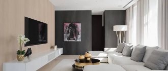
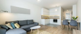
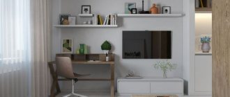
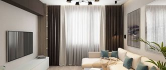
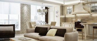
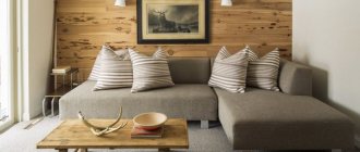
Walls are important elements of the interior, occupying large spaces and serving as a backdrop for furniture, paintings, other useful items and decorative elements. But everything can change radically if you make a bright accent on the wall, which occupies the main place in the room, which is the object of everyone’s attention and the calling card of the entire house. In most residential homes, this is the living room. Such a wall is called an accent wall; it differs significantly from all other walls in its color, texture, pattern, and image.
Placing the right accents by highlighting one wall is a simple and very common way to create an original interior.
The emphasis is on the wall that first comes into view when a guest enters the room; there cannot be two or more of them. The first 15 seconds in a new room become the main ones for the perception of information; all subsequent impressions will only be superimposed on the already developed judgment. They don’t always finish the entire wall, sometimes a part of it is enough, it all depends on the size of the room. According to psychologists, a properly accentuated workspace disciplines, and an accentuated place for rest allows the body to recover.
Basic rules for creating an accent wall in the living room
There are a large number of design techniques for creating accent walls, which solve a number of problems:
- This is an opportunity to bring bright colors, increased lighting, new lines and shapes into the interior that attract attention and create the right atmosphere. The space begins to acquire integrity and a certain charge of energy.
- This is the first thing that guests who come to the house will see; all their attention will be occupied for a certain time by the accent wall in the living room, which can help in business negotiations or in the mood for rest and relaxation.
- Using accentuation, you can adjust the geometry of the wall. Straight vertical lines visually increase the ceiling. The use of mirrors allows you to expand the space of rooms. Highlighting a bright accent wall in the middle of a long narrow room can make it more holistic and harmonious.
- The room can be conditionally divided into several areas, in one part of the room it is more pleasant to sit near the fireplace, in another to communicate with guests, etc.
Stone
In modern and loft-style kitchens, designers love to use brickwork. This could be a large or small accent wall or a kitchen backsplash.
Photo: cocolapinedesign.com
If your budget does not allow you to cover the wall with real stone, you can use artificial stone or wallpaper with a brick pattern.
Photo: remodelaholic.com
Techniques for creating an accent wall in a living room interior
There cannot be strict rules on this matter, but there are always recommendations that have been developed over decades of design practice. Color is one of the most important components of any room; if there is not enough light, mechanisms related to cold weather, loss of vital energy, etc. are activated in our head. When choosing the color of an accent wall, a number of factors are necessary:
- Intensity of natural light. Natural light is more pleasant and useful for the human eye; this resource must be used to the maximum, especially if it is not enough.
- The color of furniture elements, floors, ceilings, background walls.
- Interior style. For example, the Nordic style uses light but cool colors as a basis; the emphasis can be placed on the brightest colors. The classic style has darker primary tones; the emphasis should be placed more on contrasting colors.
- Living room size. For a large living room, it makes no sense to allocate the entire area for an accent wall; part of it is enough. This could be an area near the TV, bookcase, or desk.
There should be one accent wall, or in exceptional cases two, if the design idea requires it.
The color should suit all family members; not only well-being, but also human health depends on it.
Pastel colors are best used for rooms with windows facing north. If there is enough light, you can use cooler colors - blue, blue, turquoise, purple.
You can build an accent both on color contrast and on a softer combination of shades
Decorating the box at the entrance to the kitchen
Designing the interior of a kitchen with a huge centralized ventilation box located at the entrance is no more difficult than options with a corner location of the housing.
An oversized ventilation box eats up a considerable part of the space near the inner wall of the kitchen, this is obvious, but this layout also has its advantages over a corner layout. For example, more space is left for kitchen furniture and tables. One of the most common solutions to the problem can be seen in the photo of a kitchen design with a projection of the ventilation duct. The ventilation box is simply used as an addition to the wall cabinets, and a sink, cutting work surface and stove are installed in the resulting niche. The hood is connected to the ventilation duct by a regular plastic air duct. For those who like a spectacular presentation of the appearance of the kitchen facade, you can use a contrasting design option. The ventilation box, covered with plasterboard and decorated with an alabaster column, quite effectively sets off the red and black tones of the kitchen furniture. At the same time, the box itself also serves as a support for a small remote table.
The second most popular finishing option is decorating the vertical ventilation box with polystyrene tiles imitating brickwork. The result is a very stylish entrance to the kitchen space, somewhat reminiscent of LOFT design elements.
In all cases, the vertical ventilation box at the entrance to the room was not only used as an element of kitchen furniture, it also successfully covered the work area and part of the stove - the most loaded and littered part of the kitchen furniture.
Decorative elements
The decorative element is a kind of cherry on the cake, the final component of the interior. His choice is a responsible matter and much more difficult than it might seem at first glance.
You can create an accent without resorting to repairs - just decorate the wall with decorative elements
The decorative element must be combined with the furniture, wall color, lighting, etc.
When decorating an accent wall we use:
- tapestries;
- paintings;
- aquarium or terrarium;
- family genealogical tree;
- panels made of ceramics, metal or wood;
- objects made by craftsmen or artists;
- painting on the wall;
- Children's drawings;
- collages from photographs.
The decorations will largely depend on the style of the interior. Each home owner chooses his own style, in which he will feel as cozy and comfortable as possible. A tapestry, mirrors in a large frame and paintings are ideal for classics; for a modern style, a large photograph, an aquarium of an unusual shape, the use of glass and mirrors will fit well.
Accent mirror on the wall of the living room in the style of modern classics
Rustic or loft styles love wood and clinker bricks in all its forms. The place near the fireplace can be decorated with wooden sculptures, animal horns, and ceramic panels. For the Mediterranean style, clay and metal sculptures made in ethnic style are suitable. Japanese style assumes minimalism and laconicism of shapes and colors; the emphasis can be placed on small shelves and niches on which you can put the most important and iconic items.
In a rustic interior, a wooden shelf will successfully serve as an accent.
Bohemian style combines an abundance of bright colors and unusual objects. Mirror wall decoration and unusual compositions will be most appropriate here. For the Nordic style, a bright painting or tapestry is best.
Wooden or wicker dishes are suitable for the accent wall of a boho room
Modern eclecticism (a mixture of different styles) in the interior is the norm rather than the exception to the general rule. Previously, cultures hardly mixed; now we have no shortage of communications and information. If you can take the best from different styles, then the boundaries between them are erased. The main thing is the attitude of a particular person to materials, forms and their combination. The accent wall in this case can be very diverse, but it should attract everyone's attention and be a source of warmth, inspiration and relaxation.
Creating an accent with modular paintings
Decorating an accent wall with wood cuts
An ordinary branch and directional lamps are a simple implementation of a very impressive decor
What is a ceiling transom?
A crossbar is a separate protruding element of the load-bearing part of the floor, located on the side of the living space. Simply put, this is a support beam on which the interfloor slab “lies”. It performs one of the most important functions in the overall structure of the building and it is simply impossible to remove it completely - the ceiling will collapse.
Interesting materials:
How to preserve flower bulbs in winter? How do I save my mobile boarding pass? How to save carrots until the next harvest? How to preserve carrots until spring without a cellar? How to keep carrots fresh in the refrigerator? How to store carrots underground? How to save carrots until spring? How to preserve pink hydrangea for the winter? How to save PDF on iPad? How to save a payment from a client bank?
Lighting
Additional lighting can add new colors to a beautiful, already familiar interior, making it possible to show its relief, volume, and focus on certain objects. Spotlights, sconces, and floor lamps are suitable for this.
Accent lighting allows you to highlight the necessary details, for example, pictures, niches, shelving or curtains
The play of light and shadows magically transforms the appearance of the room
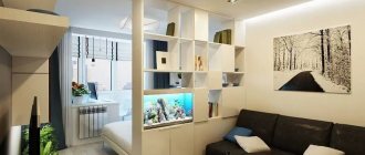
An aquarium or terrarium can be the most attractive additional lighting. Aquarium lighting produces the most pleasing colors to the eye. An aquarium can occupy quite a lot of space and completely reproduce marine or freshwater flora and fauna. The lighting reflects very beautifully from varnished wooden surfaces; the texture of the wood and its pleasant warm color are clearly visible.
An aquarium can become a highlight of the interior if you choose a non-standard place or an unusual shape for it.
Geometric patterns
The difference between this technique and accent geometric patterns is that in the first case only one wall will be decorated with them, and in the second - all the walls. If you choose geometric prints for your wallpaper, don't go overboard. Plain, discreet patterns made with soft paint look better.
Photo: muralswallpaper.com
Interesting accent wall design ideas in the living room
The phytowall will not leave anyone indifferent, especially for those who love plants. Additional plant lighting makes it possible to enjoy the green color of living plants.
A phytowall or a small picture of living plants looks luxurious and unusual in the interior of the living room.
A phytowall can be built in several ways:
- Using special phytomodules equipped with autonomous watering. The solution is not cheap, but it makes it possible to devote a minimum of time to plants.
- Buy brackets, frames and install the plants yourself.
Phytowall has a refreshing and calming effect.
Unusual apron
The kitchen apron can also be decorated. Various options will work: accent stripes made with paint or wallpaper, stonework and even vinyl decals. The main rule in this case is the combination of the apron with the rest of the kitchen design.
Photo: pelaburemasperak.com
Photo: 50 more ideas for decorating an accent wall in the living room
Decor from plates
Another popular option is decor from plates of different sizes. Designers note that it is especially suitable for interiors in classic styles. To get the perfect decor using dishes, follow these rules:
- plates should be hung symmetrically at equal intervals;
- choose a general idea: interior style, print, color, shape or something else;
- Before hanging plates on the wall, think about the concept. It is best to cut out shapes similar to your plates from paper and make the desired composition out of them. And then replace the paper options with real plates.
Photo: ylnyi.com
Mirror
Mirrors are an unconventional way to decorate kitchen walls. But sometimes they help out a lot. For example, for a long, narrow kitchen, using a large wall-length mirror is an excellent solution. It will visually expand the space, the kitchen will seem larger than it actually is.
Photo: labrys.ru
The composition of small mirrors also looks interesting. With their help, you can add light to the room by hanging them opposite the window.
Photo: homebnc.com
Posters
Posters are a simple and budget-friendly option for decorating kitchen walls. You can hang one large poster above the dining area or use an arrangement of smaller ones with kitchen-themed images. Vintage posters or their imitations are popular - they can be placed in frames for greater decorative effect.
Photo: sergiocaggia-art.com
Slate
You've probably noticed that there are slate boards in the design of cafes. This trend can be adopted and applied when decorating the kitchen. On such a wall you can change the design every day, draw with your children or leave notes for yourself or loved ones.
Photo: madaboutthehouse.com
Dark kitchen design with different accents: gold, lighting, emerald
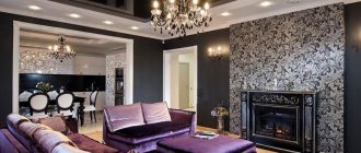
A dark kitchen is a very successful way to emphasize the originality of your interior. A black or dark brown set will look luxurious with gold accents, neon lighting and an emerald or malachite backsplash.
Art Deco Dark Kitchen Interior Design with Gold Accents
Accents in a dark kitchen play two very important roles at once. For example, they add depth to the interior and make it detailed. But even more significant is diluting the dark background and brightening the interior. After all, a dark background looks good only in some styles, for example, minimalism, and in art deco it needs additional decorative elements.
Interior of a black kitchen with gold accents in the design of bas-relief half-columns
Kitchen interiors with gold accents can vary. Classic, Baroque and Rococo are characterized by massive wooden kitchens with carved details, bas-reliefs, modules and medallions in the design of the facades. Here you can find half-columns, friezes and crowns. Some of these parts may have patination or gilding.
Two-tone beige and brown kitchen with a trendy emerald splashback and black appliances
A beige kitchen with an emerald accent is a super trendy option for a modern kitchen. In the photo above you see a two-tone beige and brown set with wood trim, Moroccan tiles on the backsplash and black built-in appliances.
Dark brown kitchen with marble countertops and backsplash and gold accents in the dining room
This brown kitchen is complemented by gold accents not in the design of the unit itself, but in the design of the dining room. Metal frames of semi-chairs and tables, lamps and zoning screens play the role of spectacular gold accents here.
Gloss black kitchen with gold accents and gray splashback with gold accents
The black kitchen with gold accents in the rendering above has an interesting feature: the backsplash design uses gold metallic accents, which look very glamorous. By the way, black kitchens with a bright color accent do not look as stylish as those with gold, silver or dark accents.
Lighting effects
An excellent solution for decorating narrow and small rooms with low ceilings is a light wall. It allows you to easily modify the configuration of the space and not load an already cramped room with chandeliers and lamps, while maintaining the desired level of illumination. And you can easily play with lighting effects on an empty wall: use ready-made backlit panels - and your room will be filled with original lighting effects in an instant.
Photo: homedit.com
Photo: interior-form.com
Photo: ledlighting.com
Photo: homedit.com
Picture frame
Wall decor with empty picture frames is a current trend in Western interiors, which is not yet so popular in our country. Perhaps such decorations have not yet taken root in Russian apartments due to the fact that we are used to saving space as much as possible, and if we hang walls, we give preference to functional decor. But it turns out that an empty frame is not a useless accessory at all. You can find an original “filling” for it in the form of interesting inscriptions, a collection of business cards or a regular calendar - such an unusual accent will come in handy for any interior and will not seem cumbersome.
Photo: sweetmagnoliachic.com
Photo: beeyoutifullife.com
However, even without additional design, a set of standard picture frames looks organically in the interior. For example, from several frames you can create an original geometric group above the head of the bed, as well as in the fireplace area of the living room or in the wet area of the bathroom, where few decors can withstand a humid environment.
Photo: royal-city.com
Photo: decoist.com
Photo: decoist.com
Photo: decoist.com
