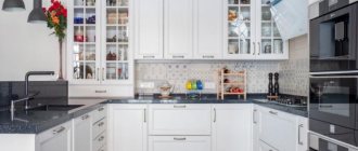
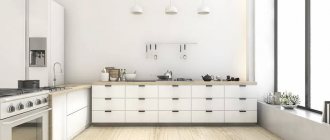
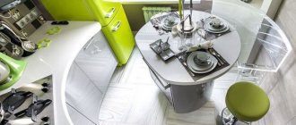
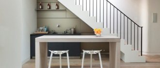
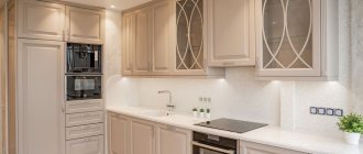
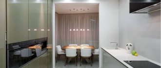
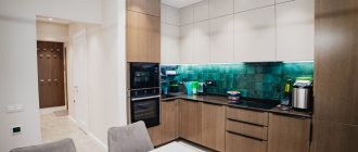
An L-shaped kitchen consists of two rows of cabinets placed at right angles to each other, creating a comfortable space to work in the kitchen. It’s easy to create an ergonomic work triangle here, simplifying food preparation.
The L-shaped kitchen layout is suitable for small kitchens in separate rooms and adjacent living spaces. This arrangement also allows you to conveniently place a table nearby.
Why choose a single-tier kitchen
Often, guided by personal preferences, they get rid of the stereotype of the classical model and create an individual, unique space. The interior is designed to be a reflection of the inner world of its owner. The originality of the kitchen model without upper cabinets is high. A radically different design, different from the usual one, brings lightness and openness.
A single-tier kitchen, which allows you to fit a sufficient number of necessary things without clutter, is quite acceptable. Such diversity becomes a fresh solution.
Indeed, why burden the work area with unnecessary furniture. The main thing is that the kitchen meets functional needs, is spacious enough, and ergonomic. The absence of unnecessary objects near work surfaces will be an excellent indicator.
For some types of kitchens, such an organizational model is simply necessary. It will smooth out the load and create a feeling of spaciousness in small rooms. Here it is important to achieve the desired effect; creating additional clutter is strictly contraindicated. An elongated kitchen will become visually shorter due to the absence of upper kitchen cabinets.
When there is little natural light, avoiding wall cabinets, combined with wall decoration in light colors, will add light and hide the gloom. Some interior styles are against unnecessary details, so a set without upper modules is perfect.
Kitchen style without wall cabinets
The optimal design option for a kitchen space without upper cabinets is any style that supports a minimalist orientation: minimalism, high-tech, modern, eco, modern, Japanese. Also, based on the area of the room, you can choose: Provence, eclecticism, chalet, country.
Minimalism best suits the single-tier model. By strictly following a light monochrome color scheme, we get a fresh, incredibly light kitchen. It is imperative to limit the placement of objects on the work surface. The linear, island version will fit perfectly.
High tech is also the unsurpassed leader of this model. Built-in appliances, thoughtful storage systems, gloss, metallic shine, restrained colors, lack of unnecessary details - an excellent solution.
Eco style is a good option. Natural materials, a pleasing color scheme, plenty of light, and natural plants will give the room more airiness and lightness.
Crossing out existing stereotypes and abandoning upper cabinets when designing a kitchen is not a fundamentally new solution. Many, trying to add freshness, lightness, trying to take off the heaviness of the interior, act in a similar way.
Country
A cute rustic style that will make even city residents feel nature. Provence has:
- natural materials;
- feigned roughness and simplicity in decoration;
- calm color scheme.
In Country style, it is easy to abandon the upper set, replacing it with shelves made of thick wooden boards.
Provence
Provence is a subtype of country, but with a French twist. It is more romantic and sophisticated. His color palette is delicate, as if diluted with milk: olive, lilac, mustard, lavender.
Since this is a subspecies of country, wooden shelves instead of wall cabinets will also look good here, on which you can place a beautiful service.
Modern
A room decorated in this style is a real work of art. It is characterized by gloss, correct and strict geometry, the use of metal, glass and even plastic.
An important role is given to lighting: this is necessarily a large chandelier and several single lamps, sometimes LEDs. But there are no requirements for the color scheme - you can even use black.
Futurism
An unusual design direction created for young and active people. It is based on white color and metal surfaces, unusual furniture and bright accents.
Any design solutions are possible here, even the most daring ones, so abandoning the top of the headset in this case will not surprise anyone.
Art Deco
Luxurious style for those who love classics. Most often used in large apartments and country houses, where the kitchen is combined with a dining area.
Only the most expensive materials are used: mahogany, silk, leather, crystal. There must be stucco molding and patterns on the walls.
If you remove the top set, then in its place there should be only paintings - this style does not like open shelves.
A kitchen without hanging cabinets is an excellent solution that will give the room originality and lightness.
It can fit into absolutely any interior. Experiment - this is the only way you will get exactly the kitchen that will delight you for many years!
Provence
“Province” is how the name of this style is translated from French. But such a “rustic” designation does not prevent it from being sophisticated and modern. Simplicity and naturalness are the qualities that attract the most in Provence style interiors. If we touch on the topic of choosing a palette, then light shades are a priority. Also among the characteristic features of the style are the presence of floral patterns in textiles, ornaments, ceramic dishes, as well as the effect of an aged surface on furniture.
Photo from source: housebeautiful.com
Table top Cedar 920/1 Milanese marble
Advantages and disadvantages
Designing a kitchen without upper cabinets causes a lot of controversy. Some find this solution modern, while others prefer classic headsets. Single-tier kitchens have their advantages and disadvantages that are worth considering.
ProsCons
|
|
Lighting organization
Lighting in kitchens is usually controlled by a central light fixture. This often causes problems in rooms where you have to cook with your back to the light. If there are no wall cabinets, good all-round lighting can be provided by installing wall lamps.
Lighting options:
- Classic lamps - they are attached to walls freed from cabinets;
- LED strips - these are attached to the wall or to the underside of shelves if you need it;
- installation of movable structures, if we need reverse lighting - we can direct the light to the sink, stove or countertop;
- traditional ceiling chandeliers - suspended or built into a suspended ceiling.
In a kitchen without upper cabinets, both pendant and spotlights along the walls will look great.
Examples for different layouts
There are no gold standards for planning a kitchen without upper cabinets; it can be implemented both in long and narrow rooms and in spacious studios. The form of furniture arrangement should be chosen based on the parameters of the kitchen.
- The corner set will fit into almost any kitchen; with its help it is easy to organize the working triangle “stove-sink-refrigerator”.
- Linear placement is ideal for a narrow kitchen; single-level sections can be placed on one side or along two opposite sides. The absence of upper cabinets will help make the kitchen visually wider.
- Thanks to the U-shaped arrangement, the issue of storing numerous utensils is solved, but it can only be realized in an initially large space.
Corner
A corner kitchen does not take up much space and is also considered one of the most convenient options. All modules are located compactly, and the housewife does not need to spend a long time spinning between them to prepare dishes. Kitchen utensils are placed here so that they are always at hand. With a corner layout, there are options for arranging a refrigerator, washing machine and other household appliances. Check them out in the photos below.
No cabinets on one side
As mentioned at the very beginning, the absence of cabinets is not only a beautiful element of the kitchen, but also reduces the functionality of the entire space. Not everyone is ready to go for it. For such people, there is an option that will preserve the multifunctionality of the kitchen, as well as make it easier: only one side of the cabinets will be removed and a corner layout will be created.
In this case, some of the modules that are removed are replaced with shelves where jars and products are placed. This option is optimal for those who are used to storing a large number of utensils in the kitchen.
U-shaped
The option without upper cabinets is perfect where a U-shaped layout is used, since it is considered the most spacious option for arranging modules. In this case, designers use a large number of floor modules, which allow increasing space for storing food and utensils.
Linear
Linear layout is a universal option for apartments. However, here a lot depends on the area that is used in the layout: for small kitchens it is better to choose another option, since then the linear layout will lose its spaciousness. In other cases, it creates an excellent composition with a symmetrical arrangement of equipment and furniture.
In this option, designers place cabinets and install columns to obtain a large amount of storage space. They mainly use built-in appliances for cooking and storing food.
Double row or parallel
In this layout, in addition to the usual cabinets and lower modules, columns or tall cabinets are additionally installed. Sideboards and buffets will also look good here. With the help of additional furniture elements, it will be possible to obtain a large amount of free space - there will be more space than in a traditional two-tier set.
With an island
The island is a separate part of the headset, which is installed separately from the overall structure. The element is multifunctional: there are storage spaces in the countertop area, built-in appliances and other details of a modern kitchen. An island will pair well with tall, freestanding cabinets.
Tricks for arranging small corner kitchens
• reducing the depth of one of the sides of the tabletop by 10 - 15 cm - of course, in this case, the useful storage space is reduced, but there is more freedom of movement;
Photo from source: pinterest.ru
• tabletop equipment under the window - when one side of the set is located along the wall with a window. This could also be a mini-tabletop or bar counter;
Photo from source: inmyroom.ru
• installing the peninsula so that one of its sides is along the wall, and the shorter side is across and not adjacent to the wall. Thus, freedom of access to the peninsula is provided on both sides at once. A bar counter/desk can be used as a peninsula. Firstly, it turns out very ergonomic. Secondly, it provides an excellent opportunity to zone the room;
Photo from source: intera-mebel.ru
• creating narrower and taller headset modules than standard options - thanks to this technique, the ceiling height visually increases and the headset looks beautiful;
Photo from source: helsingo.com
• right angle - perhaps this is the best option if the room is small. After all, a trapezoidal angle will take up more space compared to a straight one.
Photo from source: pinterest.ru
How to organize storage
The main characteristic of kitchen furniture is capacity. It is possible to find options that do not reduce it.
Place everything in the lower cabinets
The most obvious solution is to increase the capacity of the floor modules. In swing modules you can:
- install self-adhesive hooks (for ladle, pot lids);
- Attach clothespins for rags and gloves to the inside of the doors;
- use hanging baskets and organizers.
Functionality increases if hinged doors are replaced with drawers.
Place shelves, cupboards, pencil cases
You can put everything that was stored on the second tier into one pencil case. The column is the most advantageous for placing equipment.
Make efficient use of the area under the sink
Regardless of the design of the sink, the space under it can be organized rationally; baskets, drawers, and hooks are used. You can put bags, brushes, gloves in them.
What about an apron?
The lack of upper cabinets opens up an unexpected problem that needs to be addressed: the backsplash. In kitchens with top drawers, it occupies the space between modules and the walls in the work area remain protected. New circumstances require fresh solutions, because the risk of damaging the wall covering is quite high. When choosing an apron, not only functionality is important, but also design - it can transform the interior of the kitchen.
One possible solution is a full-wall backsplash for a kitchen without upper cabinets. It is made of ceramic tiles, mosaics, or the area is painted with durable, washable paint. This coating does not require special care and is easy to clean. Caring for engineered stone, masonry or concrete requires knowledge and skill, but protecting work areas with glass will make the task easier.
The apron can be designed not over the entire width or length. If necessary, its height is reduced to a meter - this is enough to protect the walls from splashes. Another option is to leave it up to the ceiling, but limit the width to the work areas - the stove and sink.
The upper border of the apron comes in two types: straight and clear, or blurred. This effect is achieved using tiles in the form of bricks, honeycombs or other non-standard shapes.
What to do with the hood?
In classic kitchens, the hood is hidden in one of the upper sections. But getting rid of them does not mean giving up additional ventilation.
There are several options for installing a hood in a kitchen without upper cabinets:
- Wall-mounted. A wide range of designs and colors makes it easy to find the right model. The hood can serve as an additional shelf or serve decorative purposes.
- Ceiling. A solution for those who prefer to hide functional devices. This type of hood is also used as a light source.
- Hidden. The market offers models of hobs and stoves with built-in hoods, as well as separate hoods built into the countertop.
When installing any of the listed models, you should take care of the air duct. The pipe is masked with a box and hidden in the wall or ceiling.
Unlike flow-through hoods, recirculating hoods do not require air exhaust. They have special filters that purify the air and release it back into the kitchen. The advantage of this type is not only the absence of pipes, but also its mobility - if necessary, it can be placed even in a room without ventilation.
Where to place the dish drainer?
Traditionally, a dish dryer is placed in the top cabinet, but other placement options are no less practical.
You can maintain the usual storage of plates in the closet by placing the dish drainer in the bottom drawer. This way the dishes will be hidden from dust and prying eyes, but you will have to constantly bend down to get them.
A tabletop or hanging dryer will help make it easier to use cutlery. Wall mounted will not take up much space, but the dishes will be visible and may get dusty. Although the desktop design takes up part of the usable space, it allows you to move it from place to place.
Kitchen with hanging base cabinets
Thinking about practicality, many people practice using hanging floor cabinets. This is very convenient because additional niches can be installed above the floor. Moreover, the floor is very convenient to clean. Dirt will never accumulate under the headset. But to attach such modules you need to take into account a few simple rules:
- In addition to wall brackets, when installing wall-mounted kitchen models above the floor, you will also need to build some kind of holding structure. With its help, the operation of the lockers will be safe.
- It is better to use wall clamps with several holes for dowels. Sometimes regular hooks are not enough. All furniture will gradually begin to settle, which will cause sagging in the countertop.
- The lower sheathing (under the cabinets) will serve as a good place for organizing lighting from diodes or daytime low-power lamps. It is convenient to install lighting in such a space, and all the wiring will be hidden between the boards and will not be visible.
- Be sure to check the permissible load after installing the housing. You can do a simple test: sit on a tabletop. If the structure holds up, then the dishes can be stored inside.
Moreover, in wall-hung models you can also install built-in household appliances. This can be a set of oven and induction hob. Such a design may look different.
Half-wall headset models are very common. Their facade can have a glossy shine or remain matte. Such lower wall cabinets must be illuminated. The result is the impression of a floating kitchen.
When using a partial upper set, the hood above the suspended lower modules can be designed as an elongated structure. This surface will act as a shelf. Together with the “floating” facade it will visually lengthen the space.
It is very convenient to have hanging shelves and deep drawers above the floor. They don't take up free space. This kitchen detail can even be organized as a small bar counter.
Hanging structures in the kitchen can be not only in the form of cabinets. Often a similar mounting option is used for separate bar counters. If a countertop of this design is made of marble or granite, then it needs additional fastening.
Optimal color scheme for a kitchen without a top
First of all, pay attention to the style of the interior, and only then decide on the choice of a suitable shade. For example, headset modules without upper structures should be chosen taking into account the shade of the room's cladding. According to designers, the most fashionable colors in the palette are:
- bright with notes of tenderness (lime, green, ash brown);
- enchanting (with paintings on the walls and façade, red, orange, pink, lilac);
- peaceful (calm pastel colors: beige, gray, white extremely rarely);
- airy (blue, turquoise, blue with whitish stripes).
Other design options are available. At the same time, cabinets should not look pretentious and rude against the general background of the room. The design of a kitchen without upper cabinets will turn out to be original if you try to alternate different shades of the lower set when arranging.
On a note! If the kitchen has built-in household appliances located on the lower tier, its doors can be highlighted with a different, similar shade. This option is especially attractive if the equipment is located on both sides of the modules.
Photo gallery
In this photo gallery we have collected examples of the design of corner kitchens of both small and large sizes, both modern and classic interiors. Click to take a closer look.
Support the project - share the material with your friends on social networks:Trend or not trend?
Just a couple of seasons ago, “topless” headsets could have been called a modern trend. Today, they have not lost their relevance, but have significantly lost their positions in the top popular design techniques.
It would be most logical to call this headset configuration one of the many possible options. Its relevance should be considered based on many factors, including:
- area of the room and the entire apartment (or house);
- lifestyle and preferences of owners;
- selected style;
- required and desired storage volume.
Neoclassical
Modern style, which is an interesting mix of timeless classics and trendy modern elements. This is a very practical design that prefers the use of natural materials or their high-quality imitations. For example, the most suitable “marble” or “wood” countertop can always be found in the catalog of the Kedr factory.
Photo from source: polinov.ru
Table top Cedar 2337/S Beige marble
Headset configuration
A kitchen “without a top” provides no less (or even more) scope for configuration than a traditional one:
- you can arrange the set linearly, U-shaped, L-shaped, or opt for a corner kitchen without upper cabinets;
- you can place floor cabinets in two parallel rows (relevant for zoning or for small, narrow kitchen trailers);
- you can provide a kitchen island;
- place the set by the window;
- add a bar counter - and the kitchen interior without upper cabinets will receive a new design;
- use open shelves, rails, and various hanging organizers as wall storage;
- complement with column cabinets with built-in appliances.
The disadvantages, however, include:
- difficulty in arranging storage space - corners and deep cabinets,
- this arrangement is not suitable for long kitchens,
- This arrangement is more spacious than a single-row kitchen, but provides less storage space than a U-shaped kitchen.
Remember that there should be enough space in the row of cabinets for food preparation. The length of the main countertop must be at least 80 cm between the sink and hob and 30 cm between the sink and the refrigerator.
Such different kitchens without upper cabinets: in the styles of minimalism, loft, Provence and more
Modern styles, especially high-tech and minimalism, offer to radically change the traditional kitchen environment, even completely abandoning bulky cabinets.
The work surfaces and overall interior design of a minimalist kitchen consist of monochromatic, often light blocks of color.
Well, the clearest marker of minimalism is the latest spacious furniture, always with smooth facades, usually acrylic or metal. The kitchen wall can be up to the ceiling, without protruding wall drawers and without fittings. Thus, the cooking area looks solid and compact.
The hood is also selected to be modern, matching the background color of the room, or invisible on the ceiling.
A loft-style kitchen without wall cabinets also looks fresh and original. And most importantly, it can be much more convenient than the traditional one.
An extensive wall finished with brick, decorative stones or rough plaster is usually the basis of any such project. The remaining details emphasize the desired atmosphere - the spirit of an inexpensive restaurant.
For example, a bar counter with a brutal forged rack, a metal railing system, and open shelves can be used to place kitchen equipment.
Plus, spotlights can be ergonomically placed on an open wall. The hood is not hidden on purpose, but becomes part of the new environment.
Let us separately highlight the cafe style - an even more extraordinary option for kitchen design. This style may include loft elements. But not necessarily.
But the most essential element of style is a bar counter or an island table, always with comfortable independent lighting. This is the starting point for creating an interior that should ultimately resemble a cozy cafe. The setting of the work area may resemble a bartender's workplace or a pizzeria kitchen.
Therefore, wall shelves in such an interior are often replaced by a wall with an unusual finish and a special design, for example:
- graphite, with chalk menu entries
- brick, decorated with posters
- lining with wood texture
- decorative stone
- glass skins with appropriate decor.
The hood can be decorated to match the chosen style. And the usual storage systems will ideally replace a wine rack, a rack hidden in the bar counter, and roof rails.
Finally, let's remember another romantic type of interior that can be taken as the basis for creating a spacious kitchen - Provence.
The French style itself welcomes natural materials and ethnic motifs in decoration and details.
Therefore, textured plaster, wooden lining or tiles in the patchwork style will look advantageous on the walls. And instead of the top row of closed sets there are shelves made of boards or forged metal, with miniature drawers, baskets.
In addition, a country sideboard can be used to store kitchen utensils. The kitchen hood can be decorated in a country style.
Taking as a basis a new model of kitchen furnishings - without wall cabinets - it is easier to make the kitchen work area bright, trendy, and most importantly - to combine completely different design ideas. Indeed, in this case, the boundaries for the implementation of ideas are removed.
Check out some more examples of what you can do in your updated kitchen space if you love mixing and matching different styles.
Loft
This is a very original brutal modern style filled with industrial elements. Here you can see a lot of rather rough-looking surfaces and interesting textures - walls with exposed brickwork, like untreated wood surfaces, concrete, uncoated chipboard sheets, plaster, etc. The surfaces are usually matte, the lines are strict.
Photo from source: designwiki.ru Tabletop Cedar 5141/Mn Moon
Alternative: partial elimination of overhead storage
Do you like the idea of partially relieving the wall of wall cabinets, but don’t want to sacrifice storage and ease of use? There is an alternative option - a “golden mean” for doubters: a partial rejection of the upper shelves of the set.
Leave one or two wall cabinets (for example, having resolved the issue with the hood and dish dryer), and you can safely discard the rest. This way the kitchen will receive the necessary “air”, but at the same time remain functional and comfortable.
Is a kitchen practical without wall cabinets?
Another objection to a kitchen without hanging cabinets is impracticality. Some people fear that it will be difficult to find space for appliances such as the refrigerator, sink or stove, and to do basic work. However, according to interior designers, kitchen furniture with lower cabinets is actually easier to use.
Thanks to this, you have easy and quick access to equipment and products. In a kitchen without hanging cabinets, you also won't have to climb on chairs to get the necessary items from the upper cabinets.
| Interior designers advise: the best choice for kitchens without upper cabinets is a low refrigerator. If a small refrigerator is not the solution for you, then you can plan it into several modules on the work surface, the latest trend is refrigerator drawers. An alternative is to place a tall building module on one wall (without disturbing the composition of low furniture) and place a tall refrigerator, oven, microwave in it. |
Kitchen furniture without upper cabinets must have a cabinet for a built-in oven and microwave, a dishwasher and under the sink. Cabinets with drawers will also be useful, allowing you to conveniently store cutlery and other accessories.
Main problems in practice
Home owners and interior designers face many challenges. These are the main disadvantages of kitchens without upper cabinets:
- Significantly reduced storage space. Utensils and utensils must be moved to other rooms and systems.
- Not all furniture and electrical appliances can be installed in such a room. Often, hanging units are used to store a gas water heater, utility systems, electrical wiring and packaging.
- A blank wall needs repair and additional decoration. In the case of new apartments this is not a problem, but in the case of used apartments it is a completely different matter. In such cases, large-scale renovations should be carried out using a good design plan.
Each case should be approached with special attention, exploring all possible options for layout, lighting and furniture organization.
Common mistakes
When installing a kitchen without upper cabinets, apartment owners are faced with errors that further reduce the functionality of the entire space and only worsen the ergonomics of the entire room. Most often, the following shortcomings are made when planning and installing this type of kitchen:
- Incorrect drying position. If you decide to choose a kitchen without upper modules, then it is not recommended to move the drying to the lower parts of the structure. Usually, for these purposes, the upper module is left above the sink, where there is no bottom or there is a small distance from the front to the bottom. Due to this design, air circulates, and moisture gradually disappears from washed dishes. If the drying is at the bottom, then the process does not work, and it is inconvenient to get dishes from below. It makes no sense to move the structure to another part of the room. It is best to purchase an additional dryer for drawers as an analogue.
- Installation of hood and outlet
A housewife who constantly prepares home-cooked food: cooks food, stews it, cooks something, simply cannot do without a range hood. Therefore, it will not be possible to get rid of this element along with the upper modules. Moreover, built-in hoods are most often also installed in upper tier cabinets. An analogue will be a box-type ceiling hood.
Placement of refrigerator, microwave and oven
Most often, apartment owners decide to simply use a linear layout for the kitchen without an upper tier. However, there are some subtleties here: if you place the refrigerator separately from the entire structure, then the atmosphere of minimalism is broken, since high technology will break the straight line in the room. In this case, experts recommend ordering built-in refrigerators of a smaller volume - among them there are budget options on the market.
In order for the refusal of the upper tier to make sense, it is necessary to maintain a minimalist style in the kitchen. The best solution would be a pencil case with a built-in refrigerator, which is installed all the way to the top. Visually, this design is similar to a mezzanine
The microwave and oven should not be left separately, since the overall atmosphere will be greatly affected in this case. It is recommended to install such equipment at hand level, since placing the equipment in the lower tier will cause additional inconvenience.
Lighting
If you need additional lighting in the kitchen, then it is not necessary to install it in the upper modules. Some apartment owners initially install it at the top of the apron, so they can fully appreciate the convenience of the technology. If you are getting rid of the upper tiers, then use this technique. Experts advise milling and attaching LEDs to the apron. Be sure to plan where and how you will place the power supply.
Sources
- https://wexy.ru/dizain-int/kuhnya-bez-verhnih-shkafov-7-nyuansov-dizajna-v-126-foto
- https://blog.gnezdo-mall.ru/kuhnya-bez-verhnih-shkafov-sovety-idei-foto/
- https://ars.ru/interer-dizayn-kuhni-bez-verhnih-navesnyh-shkafov/
- https://design-homes.ru/komnaty/kukhnya-i-stolovaya/kukhnya-bez-verkhnikh-shkafov
- https://cozynook.ru/kuhnya-bez-verhnih-shkafov/
- https://kitchen-eco.ru/mebel/garnitur/kuhnya-bez-verhnih-shkafov
- https://m-strana.ru/design/pravila-i-idei-obustroystva-kukhni-bez-verkhnikh-shkafov/
- https://salon.ru/article/kuhni-bez-verhnih-shkafov-foto-dizajn-osobennosti-aktualnye-trendy-48792
- https://kvartblog.ru/blog/dizajn-kuhni-bez-navesnyh-shkafov/
- https://minikuhonka.ru/%D0%BA%D1%83%D1%85%D0%BD%D1%8F-%D0%B1%D0%B5%D0%B7-%D0%B2%D0%B5 %D1%80%D1%85%D0%BD%D0%B8%D1%85-%D1%88%D0%BA%D0%B0%D1%84%D0%BE%D0%B2-%D1%81 %D0%BE%D0%B2%D0%B5%D1%82%D1%8B-%D0%B8-%D1%81%D0%B0%D0%BC%D1%8B/
How do you like the article?
