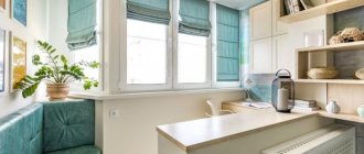
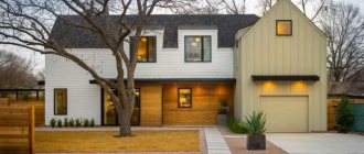
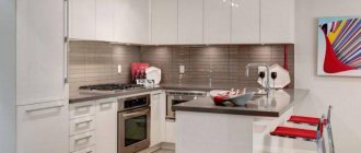
Modern house designs delight developers with a rich selection of styles and diverse materials for construction and finishing. In order to keep up with trends in the architecture of private houses, people strive to build not only high-quality housing, but also well-thought-out housing in terms of layout and saving free space. Projects of studio houses are considered one of the most laconic and relatively small buildings.
Project and original design of a studio house
Studio houses are not a single direction of architectural design or distribution of usable space, but a whole range of layouts and varieties that include many design solutions. In the recent past, studio projects were most often found in budget apartments, where a living room fit in one room along with the kitchen. However, such a technique as studio layout was adopted by many designers and began to bring the most unusual and creative projects into reality.
Pros and cons of the layout
Often there is a combination of a kitchen and a guest area, so you get a studio kitchen with a living room. Of course, with this solution the functionality of the room increases: you can cook in the kitchen area and communicate with guests who are in the guest or dining area.
The advantages of studio kitchens are as follows:
- there is a lot of air and light;
- rational use of space;
- placing more people in the room;
- the ability to control the actions of children playing in the living room area.
Of course, there are also disadvantages to this type of layout:
- odors of cooked food may spread to other areas;
- loud sounds of kitchen appliances (mixers, dishwashers, etc.);
- grease particles from the kitchen area can spread to the upholstery.
Selection of finishing materials
It was already said earlier that when choosing finishing materials it is important to take into account the style of the interior taken as a basis. It is no secret that it is now fashionable to use natural materials, so you can focus on them. For example, a popular solution is to use wood, both for finishing the floor and covering the walls with wood panels. Wood is also suitable for equipping a studio kitchen with massive furniture, which is especially popular when arranging a dining area (an oak table is an elegant and attractive option, relevant for almost any style).
It should also be noted that natural materials are expensive and not everyone can afford them. You can save money by using more affordable materials, for example, practical and comfortable tiles, pleasant laminate or parquet, inexpensive linoleum. When working with walls, you can limit yourself to paint, giving them the desired shade. An equally interesting option is to decorate the walls of a studio kitchen with tiles and wall panels. The use of wallpaper is also allowed, the main thing is to buy waterproof coatings, for example, washable wallpaper.
Solving planning problems
Of course, the problems listed above are easily solved. First of all, a beautiful and functional hood will fit perfectly into the interior of a studio kitchen and will also save you from cooking odors. It can also solve the problem with fat particles; in addition, the hood can give a feeling of freshness in the room.
Modern household appliances often operate in silent mode, which can definitely solve the problem of unnecessary sounds from the kitchen in other areas of the room.
Design solutions
In photos of studio kitchens posted on open sources on the World Wide Web, you can often see the owners using tempered glass with protective films. This solution undoubtedly gives kitchens a neat look. At the same time, dust, fingerprints, and stains will not be visible on the surfaces.
Natural stone is also often used; any cleaning products can be used to clean such surfaces. The problem of limited space can also be solved by modern storage systems (drawers, wardrobes).
Stylish invisible kitchen designs
Black and gold tones
If you want to add a touch of elegance to your interior, you should try using black and gold. At the same time, the cooking area should not stand out from the overall luxurious atmosphere.
Use glossy panels in a neutral color to hide clutter at parties or dinners with friends. If desired, the panel can be opened slightly to free up part of the countertop for mixing cocktails or removing a bottle of wine from the mini-fridge.
Cozy minimalism
Many are afraid of minimalism, considering it a faceless and inconvenient style for glossy magazines. It seems that if you hide the stove, countertop and usual shelves behind the doors, you will end up with something very strange and uncomfortable.
Meanwhile, nothing will stop you from creating comfort using the usual tools - a convenient color palette, comfortable furniture, beautiful accessories. Such a room will look more laconic due to the large number of straight lines.
The galleried kitchen cleverly concealed the huge storage and work surface using a combination of different sliding doors. If it were all left on display, the beautiful chandelier, elegant dining area and soothing color palette would go unnoticed.
Monoblock kitchens
For small apartments and studios, designers are developing kitchens that have everything needed for cooking. You can buy such a unit, connect communications - the kitchen is ready. All kitchen upholstery is hidden in the closet.
Fully functional kitchen hidden in a closet
Kitchens too - monoblocks are called bachelor kitchens. They are supplied with a standard set of equipment; more expensive plants are equipped with monoblocks at the request of the customer.
Full kitchen without a refrigerator, designed in a single module, finished in walnut veneer
This market segment is considered very promising. The flagships of the global kitchen industry, such as the German Bulthaup, also presented a series of kitchen sets from which you can assemble any kitchen. True, they are not suitable for a small apartment. Wardrobes - columns are installed in the center of the room; access to them is needed from all sides. They don't save space, but they look impressive.
Passage space
The kitchen of this country house is located at the checkpoint. On both sides of the set there is a large corridor in both directions, and in front there is a glass door leading to the garden.
Therefore, everything unnecessary is hidden behind doors that match the color of the walls. When closed, the kitchen becomes a visual extension of the hallway and does not attract attention. This method can be used not only in a spacious country house, but also in an ordinary dacha or apartment with a non-standard layout.
Non-standard layout
A kitchen hidden in a wardrobe expands the possibilities of interior design. To create this monochromatic white project, they chose a cool white MDF cap, a backsplash and a quartz agglomerate countertop. The hob, appliances, sink and faucet are also white. This combination is complemented by sliding doors with mirror inserts. They visually open up the interior and play a decorative role.
Another unusual feature of this area is that it is located in a niche. This project can be repeated by agreeing on requalification with the BTI. According to the rules, the wetland and the stove can only be located in the non-residential premises of the apartment, that is, the niche must be, for example, in the corridor. But you can take out the refrigerator where it is most convenient for you to put it.
A bright accent in space
A great way to draw attention away from the kitchen is to add a large, bright accent to the space. This “something” should be really bright and large, stand out from the general interior and attract attention. This could be a huge seating area in the living room in acidic shades, a bright painting or a modern installation. Having a bright accent will allow you to “hide” the kitchen and so on.
No wall cabinets
The presence of sections is a traditional feature of kitchens. If you remove the upper cabinets, the visual space will change dramatically. Complement this with minimalism and overall color schemes to make the space more harmonious.
Revolution in the work area
Sliding table tops
The Italian factory Toncelli has introduced a sliding tabletop mechanism into its invisible kitchens. Made from Corian, wood or stainless steel, the tabletop glides smoothly and quietly to create a breakfast area. Or a bar counter. Under the top there is a countertop with built-in appliances (hob, extractor hood, sink, mixer). When closed, the kitchen island does not resemble the main kitchen element in any way.
Kitchens with standard worktops
Kitchen with slanted doors to close off the work area
A kitchen work area with a standard worktop can now be used in a new way. All appliances placed on it, including the sink, hob with hood built into the countertop, are covered by the facades of the upper open shelves. This mechanism can be used both in the entire working area and in some of its places. This is truly a radical change in what the workspace can do. Change the look of your kitchen by allowing you to take your kitchen from working to front-facing in a simple and very fast way.
Kitchens with wide countertops
Tabletop width is the value of the variable. For large kitchens, it is natural to have a worktop wider than the usual 60 centimeters. The space along the wall is used to store small working kitchen appliances, hoods, sockets, clotheslines, spices, knives, etc.
Kitchen with large countertop and storage system in the work area
This frees up the entire work surface, making the kitchen look neat and respectable. The upper and lower walls form a single object, not much like a kitchen in the usual sense. There is no so-called apron; its role is played by facades made of modern durable materials. Kitchens with large countertops are often built into niches at the depth of wall cabinets. This visually reduces the volume of the kitchen unit.
Lighting of zoned space
Of course, kitchen design in a studio apartment requires several types of lighting. After all, a standard chandelier in the center of the room cannot remain the right solution in interior design. Indoor strip lighting can help. This will provide the required level of lighting.
In this case, you need to adhere to the main rule when planning: in the kitchen there should be more bright light, in the living room there may be a little less light, and it can be soft, diffused. Floor lamps and floor lamps will help with this.
Gallery of original ideas for the interior of a living room in a private house
Stylish custom living rooms:
An interesting solution for lighting Source m.yukle.mobi It’s difficult to decide whether billiards complement the interior or vice versa Source topdom.ru A house made of hand-cut logs is recognizable from the inside Source nextews.com A very cozy rocking chair Source lider-stroi.ru Mirror ceiling - an unexpected solution for the living room Source yandex.ru Futuristic notes in combination with classics go very well Source houzz.ru The living room looks very cozy Source sakhexpo.ru For those who love unusual solutions - a summer living room on the water Source kfetele.ro
Color differentiation
Since we are talking about color, we can divide the zones in the room using color. For example, you can use lighter shades in the kitchen area, and darker shades in the recreation area. Colors can either contrast with each other or be similar in shades.
If your room is small, you can make one wall brighter and the rest in more neutral tones.
Style solutions
Very often, recently, spaces are decorated in a loft style. In contrast to this style, you can decorate the room in a French country style. However, it can be the sensational Scandinavian style, hi-tech, minimalism, in general, everything that will be close to your soul.
In studio kitchens, the interior design can be absolutely anything. Here, of course, you can seek the help of a professional. But if you want to solve all the problems yourself, and become a kind of specialist in the field of interior design, then turn your attention to styles that are convenient from a functional point of view, where you do not need to work out all the details with special care.
Kitchen studio in French style
This style is very simple to implement and can be implemented independently, without the help of a design professional. The kitchen area should be bright, it is possible to use tiles with a landscape. Fresh flowers are welcome in kitchens of this style.
A large amount of textiles and muted tones, properly selected decor can give the kitchen area French aristocracy and chic. Of course, in small areas of studio kitchens, French Provence or the style of a street cafe in France is suitable.
Video description
For examples of classic style, watch the video:
- Gothic style.
Aged or artificial stone or wood with a textured pattern is used as flooring. The walls are lined with imitation stone masonry, which is complemented by inserts of wood and silk wallpaper. The windows are wooden with stained glass painting. Tones: black, brown, dark red, yellow and blue, white.
Unexpected Gothic Source www.neomebel.ru
- Eclecticism.
Multi-level ceilings with spotlights. Stucco molding on walls and ceilings. The floor is made of wood with a variegated texture.
Kitchen studio in loft style
Many people think that the loft style is the ideal solution in interior design. However, here it should also be understood that such a decision will not be correct for every apartment. Of course, in apartments with smaller square footage it is unlikely to be possible to create a real loft. But it is still possible to recreate the features.
The loft is distinguished, first of all, by high ceilings and large windows. At the same time, it is not necessary to cover the ventilation pipes from view, which cannot be called inconvenient, especially in the kitchen area. After all, this is a style decision.
Also characteristic of this style are brick walls. Still, a loft is more suitable for modern people who lead a dynamic life. A kitchen that looks like a concrete jungle is quite different from kitchens in the French Provence style.
At the same time, interior items can have cracks and this will look very interesting in combination with this style. It is also better to install in such kitchen areas only modern appliances that will be cast in steel. If you like studio kitchens with a bar counter, then the loft style will suit you for this design solution.
General information
Private houses in the form of studios are not a single direction of architectural design or competent distribution of free space, but a number of varieties and layouts that will include many design solutions. Until relatively recently, studio projects were most often found in inexpensive apartments, where one room contained a living room, a kitchen, and a sleeping area. But this technique, such as studio layout, was adopted by most designers and began to bring to life the most creative and extraordinary projects.
Kitchen studio in minimalist style
A minimalist style can be an excellent solution when zoning space and interior design. In this case, there will definitely be a lot of air and light in the kitchen area. The style is characterized by strict shapes and lines, built-in appliances that help save space, a minimal number of decorative elements, and neutral shades.
In a minimalist style, the interior should be either monochromatic or contrasting in color schemes. It is recommended to use 2-3 color shades.
Color accents in the minimalist interior of the kitchen area can be red, yellow, and blue tones. It is also possible to combine different structures: wood, stone and other materials of different shades.
Recommendations for surface finishing
For each direction there is a basic set, however, no one is prohibited from playing with styles: the effect can be amazing.
- Empire style Karelian birch, thuja, and rosewood are used to finish the floors. The walls can be lined with marble or decorated with silk-based wallpaper. The ceilings are decorated with stucco and frescoes. Plastic windows with a rich interior will create dissonance, so preference should be given to wooden ones. Characteristic tones: blue, cyan, red, ivory, white, bronze and silver.
Peaceful Empire style Source antonovich-home.kz
- Classicism.
Decorative plaster, fabric and vinyl wallpaper are used for the walls, and the ceilings are decorated with stucco. Windows and doors are selected from solid wood. Floors: wood or marble. Pastel tones.
Scandinavian style
Of course, one cannot help but pay attention to the recently sensational Scandinavian style. This style is a combination of coziness and comfort. It will be an ideal solution for a small studio apartment space.
The main thing in the Scandinavian style is functionality and practicality; everything else is given secondary roles. In studio kitchens, natural materials, a large amount of wood, a white background, and strict forms are often used here.
In general, white color and its various shades are a distinctive feature of the Scandinavian style. With this decision, a massive dining table will help to separate the kitchen area from the rest. Scandinavians also prefer natural carpets and open shelves in the kitchen so that white dishes can be seen.
Other style solutions
Decorating a studio kitchen in the avant-garde style will be a bold and radical decision. Every detail is important here, nothing is superfluous. Each element participates in creating a unified and harmonious space.
In the avant-garde style, plain wallpaper or simple kitchen sets are not welcome. It's trivial. This style is chosen exclusively by creative people. In contrast, it is worth mentioning the country style. He loves natural, unpainted wood.
Often the space in the kitchen is organized as an island, which is not used in other styles described.
Furniture
One of the most common ways to divide space is to use furniture.
Bar counter.
Probably the simplest solution to zoning living space. Such a partition can be used as a shelf with various kitchen utensils, as a place to store alcohol, and, of course, as an addition to the interior. In addition, the bar counter can be decorated with various wine glasses and hanging structures - this will make the space look only aesthetically advantageous and harmonious.
Closet.
A wardrobe partition with sliding doors can be an excellent option in solving the problem of zoning a room. Firstly, such a design will immediately perform several important functions in a small apartment - storing all the clothes and accessories of the residents and dividing the room. In addition, at the moment there are a large number of types of various wardrobes, so choosing exactly the right design may be difficult, but definitely doable. This could be a double-sided wardrobe, where clothes are stored on one side, and shelves for storing kitchen utensils on the other. To save even more space, you can build a structure with a built-in bed. Then you can immediately combine a wardrobe, a bedroom, and part of the kitchen set in one design.
Another option for dividing the room could be, in your own words, the kitchen unit itself.
In this case, the space will be divided by floor cabinets. A linear kitchen will perfectly divide the space, and will also save a lot of space, because... This design involves built-in appliances and even a refrigerator. Alternatively, you can move the sink into this design, but then it’s worth discussing this option with experts in advance. This is done in order to lay down all the risks in advance and make correct calculations for the design, because such an experiment can easily lead to an increase in the cost of all further work.
Sofa
- another way to divide a room. This option will be much cheaper than the previous ones, but will do an excellent job of separating the living room from the kitchen. Any sofa will do, but you should keep in mind that elongated corner structures that can also replace a bed will look best.
The last and no less popular way to zone space can be to include a dining table
. If you often invite guests over or simply like to spend time at the dinner table, then this option can be your lifesaver. For those who are often visited by friends or relatives, an option with a long table that will visually divide the spaces is suitable. For those who do not often receive guests at home, a regular transformable table is suitable.
Get everything at once
Kitchens combined with a living room are an excellent option for a large family. After all, each family member has their own characteristics and interests, which can be taken into account and combined in interior design. Some people spend more time in the kitchen area, while others prefer to be in the living area, for example, watching TV.
With this organization of space, each family member can freely see and communicate with each other. This arrangement of space is also convenient for receiving guests, when you don’t have to run from the kitchen to the room every time in order, for example, to put prepared dishes on the table.
However, nowadays the kitchen combined with the living room is a cozy large space where you can bring absolutely any of your design ideas to life. The main thing is to be able to stop in time and not overdo it.
Appliances
- Hide the refrigerator, dishwasher, washing machine behind the facades of the set. This is not only a matter of interior design and beauty. Kitchen facades provide additional sound insulation, and built-in appliances are quieter.
- Choose silent models and carefully read the description: the noise level of the refrigerator should not exceed 39-40 decibels, the hood should not exceed 50 decibels. Before purchasing, be sure to read the reviews for the selected model. If the slightest noise bothers you, don’t skimp on technology. Typically, the more expensive the model, the quieter it operates.
- Always turn on the hood when cooking. Don't buy a cheap one - it's of little use. You just won't use it. Without a powerful hood, the furniture upholstery and textiles in the living area will quickly become covered with plaque and will actively absorb kitchen odors. For a small apartment, it is better to buy a built-in hood - it is compact and not noticeable.
- The big advantage of a combined kitchen-living room is that you can use one TV. Position it so that the screen can be seen from anywhere in the studio space.
