People have long tried to make their place of residence cozy and comfortable. This desire does not disappear, even if the apartment is small in size. Apartment design 32 sq. m. can be no worse than a large and spacious one. One-room apartments are becoming popular not only among young people, but also among established families with a child. This can be easily explained by its low cost, practicality and functionality.
The desire to live comfortably cannot be avoided, even if you are the owner of a tiny apartment
It is much easier to care for a small area. In a small apartment it is easy to implement any ideas without high costs, but in a large apartment it is problematic to do this. However, when planning, it is still worth considering certain nuances. Illiterate arrangement can turn an already small space into a “closet” unsuitable for habitation.
Design features for apartments
One-room apartments are in demand and there is a lot of evidence of this. For example, almost all new buildings have apartments of 32 sq.m. and they are sold out quite quickly. This apartment is an excellent option for young families. There are also small apartments in Khrushchev and Brezhnev buildings. Then we are talking about the secondary real estate market.
The arrangement of a small apartment largely depends on the number of people living in it.
Be that as it may, when purchasing property in a new or old house, you can remodel it the way you like. One-room apartments have significant disadvantages that are important to consider when planning correctly:
- small area;
- in most cases, such apartments have low ceilings;
- small kitchen and bathroom;
- narrow corridor;
- no mezzanines;
- in rare cases there is a balcony or loggia, but more often there are none - this one important nuance is often forgotten;
- One-room apartments are often located in high-rise buildings.
An undoubted advantage of one-room apartments is that they are always surrounded by other apartments, so they are warmer. With an apartment layout of 32 sq.m. you should adhere to these rules;
- You can't force free space. More light and space is the right solution. Minimalism looks better in one-room apartments.
- More light. If natural lighting is not possible, then sconces, floor lamps, and lamps will come to the rescue. Residents are lucky if their apartment is on the sunny side or has a large window.
- In a one-room apartment you can give free rein to your imagination and play with colors. In this case, it is not necessary to adhere to the standards: white ceiling, dark floor. The ceiling can be any color, but several shades lighter than the walls. This will help visually enlarge the room.
- A glossy ceiling and mirrors will visually increase the space.
- Built-in furniture is an excellent solution for small apartments, where every centimeter visually changes the “picture”.
- Use a cabinet, bar counter or rack, or niche as a partition.
Work zone
This is a place where a person can perform some types of work. As a rule, a modern workplace cannot do without a multifunctional computer desk, which will be comfortable to sit at. This table can be placed near the window.
The window sill, if it is wide, can act as a tabletop. Thus, more usable space is used. If there is no space in the room for a desk, it can be placed in the kitchen.
Styles and colors for apartments 32 sq m
The design and interior of a one-room apartment of 32 square meters is based solely on the preferences of the residents. On the modern market there are a huge number of ready-made projects that can satisfy even the most picky clients. Most often, residents, when making renovations in a small apartment, resort to minimalism.
Simple, roomy furniture with geometrically correct shapes is suitable for a room in a minimalist style.
Minimalism is simple but at the same time functional, which is an excellent solution. It is better to use light shades, a minimum of details and compact, functional furniture. In this case, there is built-in furniture.
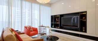
Built-in furniture allows you to make the most of the space in a small apartment
For young families, the colonial style is original and at the same time stylish. It combines comfort and convenience. A characteristic feature of this style is the juxtaposition of exotic overseas inclusions with traditional motifs. Different materials do not conflict with each other, but complement each other. This could be wicker furniture next to metal lamps. All this creates a bright contrast between Eastern and Western culture, which comes together in this interior.
Colonial style is classic mixed with ethnic interior trends
For older couples, interior design in a typical Provence style is considered a good design solution. Wooden furniture is combined with bright textiles, which creates a special atmosphere of comfort and home. This type of interior is often used in America and can often be seen in movies. General family photographs will be perfectly placed on the walls; the main focus will be the kitchen.
The interior in the Provence style is characterized by an abundance of light, field themes and retro colors
High-tech is considered the complete opposite of the previous style. It has echoes of minimalism, but this style uses exclusively new items and combines basic colors: black, white, metallic. A bright accent is the shine, gloss of furniture, glass and mirrors.
Monochrome design emphasizes the rigor of high-tech - nothing superfluous, only black and white
In any style, you should avoid bulky and massive items that take up a lot of space and hide an already small space.
In the kitchen, it is better to use built-in appliances, placing the furniture in one line. For example, along the wall. The kitchen can be separated from the living room by a bar counter or a bookcase or wardrobe. In the living room, the TV should be hung on the wall, and an additional bedside table should be placed under it. In the work area, you need to change the lighting, place additional lamps and floor lamps there. The sleeping area can be separated from the main space, for example, by a curtain.
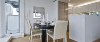
A compact set of direct layout will save space for the dining area
Nuances of furniture arrangement
Regardless of which version of the kitchen layout is 30 sq. m. you choose, you should consider that:
- It is better to arrange the stove, refrigerator and sink by following the rule of the triangle: the sink should be its central vertex, and the stove and refrigerator should be at the sides. The distance between the peaks should not exceed 1.5 meters. This arrangement will make the cooking process much easier for you.
- It is better not to place the sink close to the wall, especially to the corner. Dirt and grease flying onto the wall will accumulate in the joints and will be difficult to clean.
- The “working triangle” should be well lit; spotlights can help with this.
- To avoid regular jogging, it is better to place cabinets with dishes, spices, etc. closer to the “work triangle.”
Styles and colors for studios 32 sq m
The design of the studio apartment is 32 sq.m. The fact that the space is not delimited in any way must be taken into account. Such apartments usually have high ceilings and panoramic windows. A different kind of minimalism can be used here. The finishing should include imitation wood, brick or concrete. Furniture in a minimalist style will look great in combination with antiques. A large number of plants, accessories, figurines, decorative pillows, candlesticks will fit perfectly into the overall interior.
The living area of a studio apartment must be divided into two zones - public and private.
It is better to choose a folding bed. During the day it can easily be hidden in a closet. This solution will help save space. Mirrors should be placed on the walls or cabinets. They will visually expand the space. A similar effect will also be achieved by wallpaper with vertical stripes. Approximate design of a studio 32 sq. m. photo.
High-tech is also suitable for a studio apartment. Modern innovations help separate functional areas from each other, but do not take up much space. The effect of spaciousness is created by light colors and a lot of light. If there is no access to natural light, then lamps and a chandelier will come to the rescue. In the interior you can use not only wallpaper and paint, but also wood. This will help make the transition from different zones smoother.
High-tech with a predominance of white in the interior is the choice of those who want to impress others
Choice of colors
Think over a beautiful and stylish interior design for a kitchen-living room of 30 sq. meters is impossible without competent selection of colors. At the same time, there are two main approaches to solving this issue - a single range in similar tones or a contrasting combination. In this case, the background (walls, floor, ceiling) should be neutral, this allows you to emphasize the design of furniture and decorative elements. Calm colors of surfaces and a rich range of textiles and furniture look most harmonious and advantageous, without overloading the interior. The abundance of bright colors, not shaded by calmer ones, tires the eyes.
To divide a room into several zones using one color scheme, shades of different saturation are used. For example, the kitchen may be a tone lighter than the dining room, and the recreation area, in turn, a tone darker. When the interior is divided into several areas in contrast, combinations of white with olive, silver-gray with green, vanilla with chocolate color look good.
Important! Try not to overload the kitchen with dark colors; in large quantities they not only create a too gloomy interior, but are also simply impractical - dust and dirt are clearly visible on black and dark brown.
Styles and colors for Khrushchev buildings 32 sq m
Khrushchev buildings have a special layout, which has a certain set of disadvantages. The design of a Khrushchev-era 1-room apartment of 32 square meters puzzles many residents. Sometimes even a few free meters can make an apartment more spacious and functional. High-tech, minimalism and even Provence will be an excellent solution to the design problem. It is better to make the walls light in pastel colors.
The photo shows a room in a high-tech style, presented in various shades of gray - a cool tone of marble flooring combined with warm gray on an accent wall
It is strictly forbidden to use large patterns. They visually conceal space. The emphasis should be on the furniture. The materials on the walls can be anything: wallpaper, tiles, wood, paint. This is an excellent solution in the design of a one-room Khrushchev apartment of 32 sq. m.
Even if the colors are pastel, you don’t need to combine many colors at once. Excessive diversity will only get in the way; the room will seem too crowded.
A modern answer to old white painted ceilings is glossy or matte stretch ceilings. You can forget about installing plasterboard - this will make the ceiling even lower.
For a small room, a modern interior design with a minimal amount of decor and furniture in light colors is ideal.
In Khrushchev it is absolutely worth refusing to use historical styles that require a lot of decor, such as classicism, empire style, baroque, rococo, gothic. These directions involve the use of a room with high ceilings; this is unacceptable in the design of a small room. Otherwise, you risk getting an apartment that looks like a cramped museum.
Stylistic directions
Almost all stylistic diversity is available to owners of small apartments. It is not recommended to embody classics, futurism and loft in cramped rooms. These styles are best revealed in spacious apartments of private houses or luxury apartments with large footage. But this does not mean at all that they cannot be used. It is possible, but selecting compromise solutions with great care without compromising the main concept of the direction. Conservatives and supporters of traditions choose modern, art deco, Biedermeier, colonial, Mediterranean, antique, retro, gothic, contemporary. For those who are young at heart and follow everything new, high-tech, avant-garde, minimalism, grunge, constructivism, fusion, and the Scandinavian direction are suitable. Lovers of cozy, “warm” interiors should pay attention to Provence, eclecticism, country, shabby chic, and Romanesque style.
Design of rooms in apartments 32 sq m
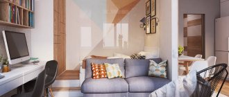
The living space in a one-room apartment can be divided into two parts by an open shelving
Bedroom
It will not be possible to place a lot of furniture in the bedroom, but with proper arrangement it will be possible to place a bed, a wardrobe and even a bedside table and there will even be room for a floor lamp.
The sleeping area in the common room is fenced off with a shelving unit, one of the shelves of which acts as a bedside table.
It will be more economical, both in terms of money and space, to purchase a bed-wardrobe. It can fit a lot of things on the sides, and the center is great for a bed.
Work zone
The work area can be separated visually: place more floor lamps and lamps there. Light will help you focus on important issues.
A work area in the living room, designed as a stylish hanging table
Living room
A sofa and a suspended TV would be appropriate in the living area. Under it, bedside tables with things will fit perfectly.
A great way to save space would be to install a podium in the room on which the living area will be located.
At night, a wide bed extends from under the podium, providing complete rest
Bathroom and toilet
It is better to tiled the bathroom and bathroom. This option is suitable for both adjacent and separate options.
A small bathroom will seem more spacious if you line the wall with mirror tiles
If you cover the wall behind the toilet with cabinets, communication pipes will hide and there will be space for storing things
Refusal of a bulky bathtub in favor of a compact shower cabin will save space for the washing machine
Kitchen
Furniture should not take up much space. You can hang the maximum number of cabinets in the kitchen. Place items that are used more often on the lower shelves.
The kitchen area will become much more spacious if you abandon the usual table, replacing it with a functional bar counter, which will be used both as a table for a quick breakfast and as an additional work surface
Hallway
Paintings and mirrors would be appropriate in the hallway. They will visually expand a small space.
The optimal solution would be to install a built-in wardrobe with mirrored doors.
Rest zone
The living area should preferably be located directly opposite the entrance. The furniture of the recreation area includes a standard set consisting of upholstered furniture and a small coffee table. If desired, you can place a soft corner there, which will give additional comfort to the room.
Don’t forget about the space that is located under the window opening. It can also be used to great advantage. However, it is better not to place large-sized furniture there, as this will create some inconvenience during use.
Arrangement of space using zoning
Zoning will help separate the “rooms”. A cabinet or bar counter is perfect for this. This not only saves space, but is also practical. The bedroom can be separated with curtains. A podium or other elevation will help to visually divide the space.
Kitchen studio with a bar counter, complemented by original hanging shelves
Zoning a studio apartment in a Scandinavian style with a sliding glass partition
An excellent solution is to use cabinets instead of partitions
A small apartment, given the right, proper furnishings, can be much more comfortable and spacious than a large one.
You may also like
Interiors
Design Bureau "Sila Group"
30.11.2018
Exclusive and complex renovation work. Policy of an integrated approach for the ideal implementation of the project The design bureau “Sila Group” specializes […]
More details
Interiors
Loft for the mafia
24.02.2021
Only a real man can “smooth all the corners” in a relationship with a woman, and “smooth all the corners” when creating […]
More details
Interiors
Design project of the beauty salon “GoCoppola”
18.02.2019
13th layout option. This is where work began on the project for the flagship beauty salon of the GoCoppola chain in the shopping center […]
More details
Interiors
Boutique Hotel Grand Sova
16.11.2018
Grand Owl appeared in Ples in 2016. A cozy boutique hotel with 14 rooms with a spa complex and its own […]
More details
Interiors
Design of a two-room apartment in a modern style, residential complex Saturday
28.05.2019
Our design studio has developed the design of a two-room apartment in the Saturday residential complex, room area 65 sq. m. m, with a beautiful view [...]
More details
Interiors
Korneev Design Workshop - apartment in Moscow
17.10.2018
Interior design workshop Korneev Design Workshop - https://akorneev.com, founded by Anton Korneev and Ekaterina Blokhina, presents a new project […]
More details

